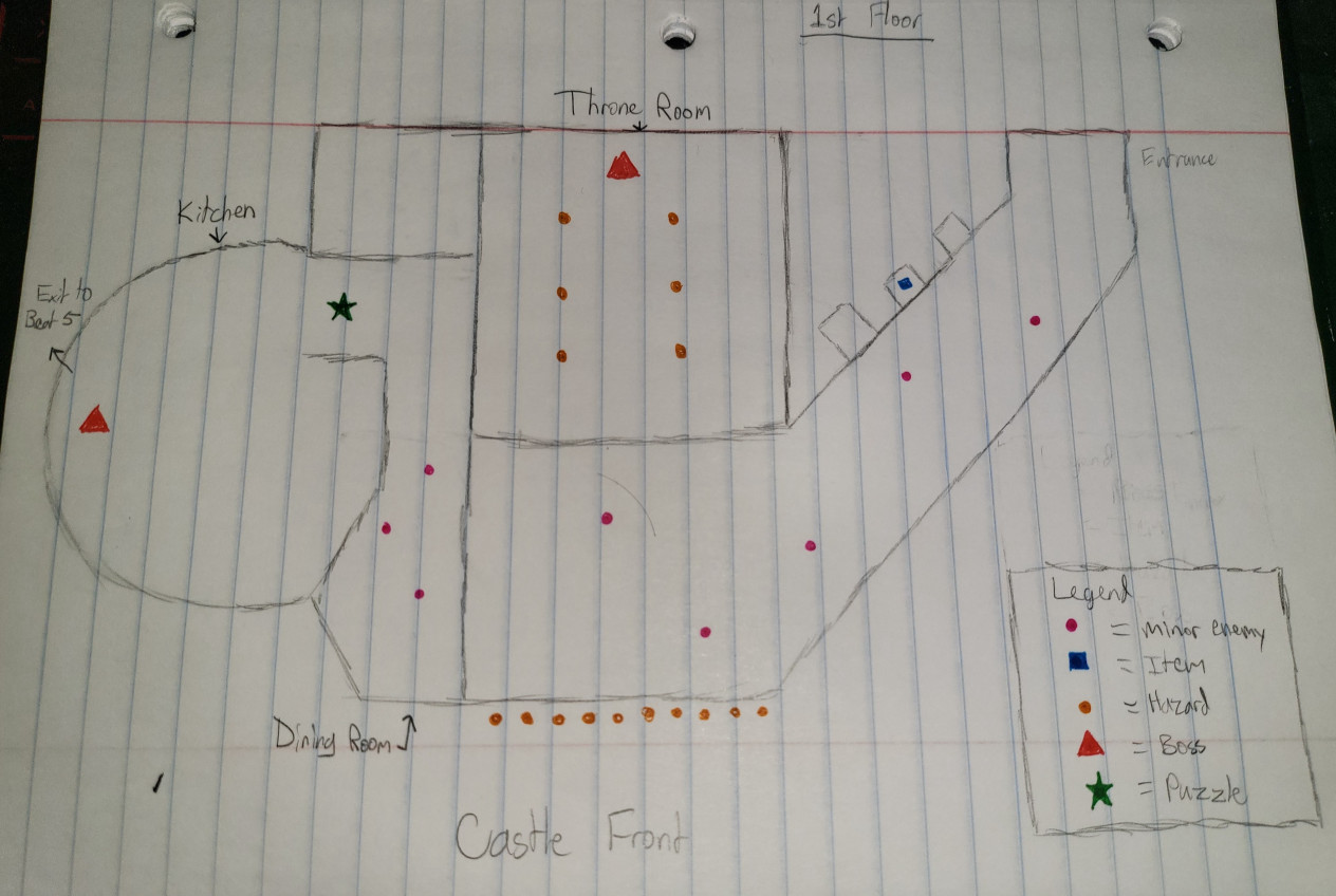
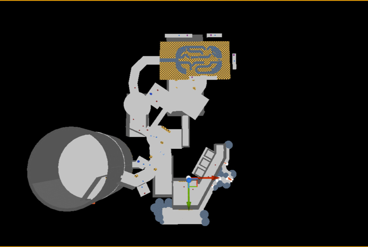
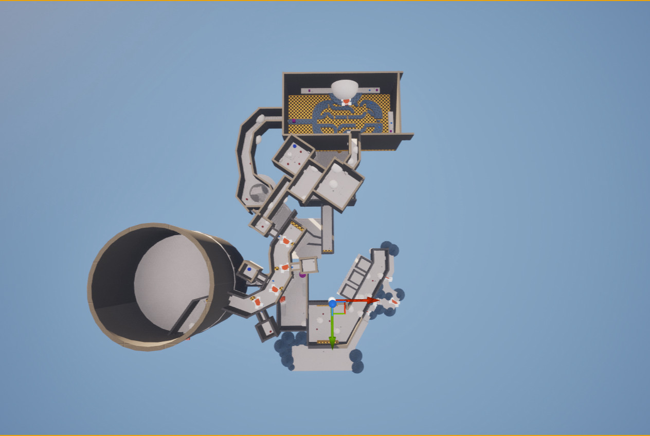
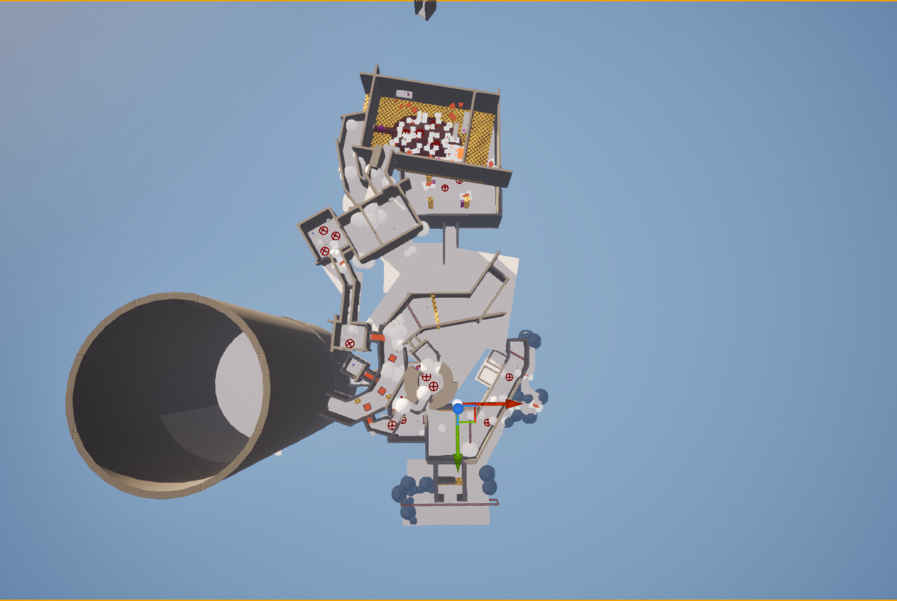

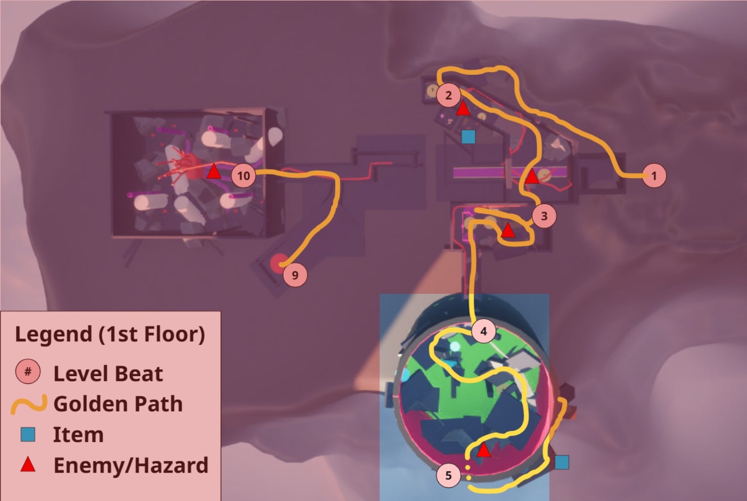
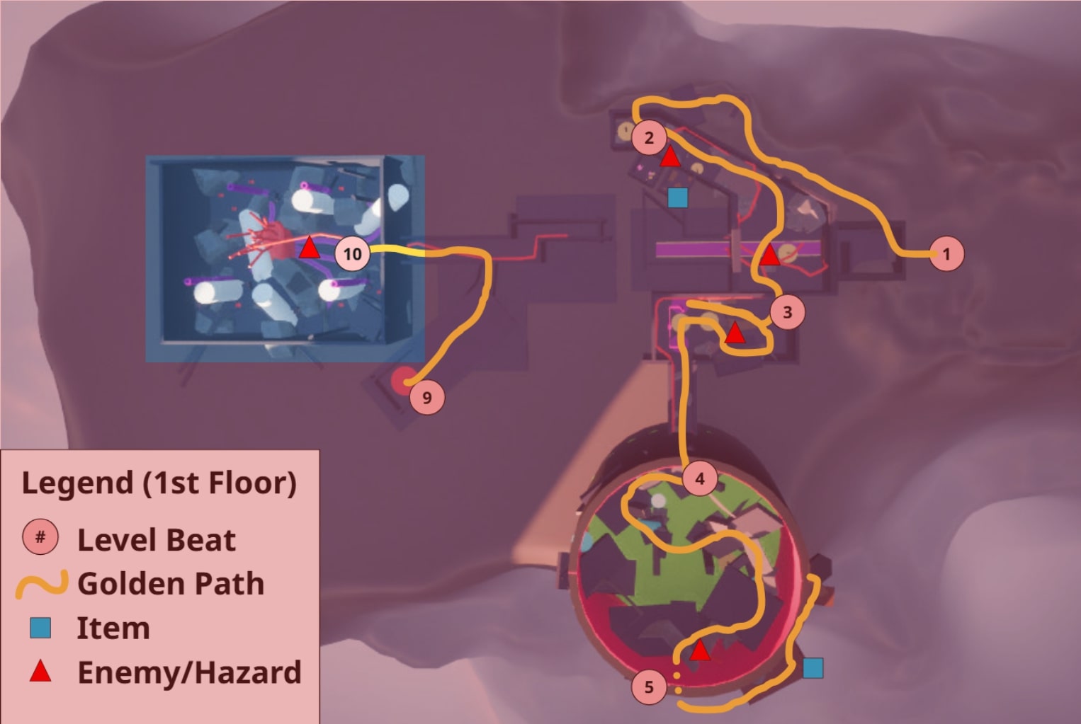


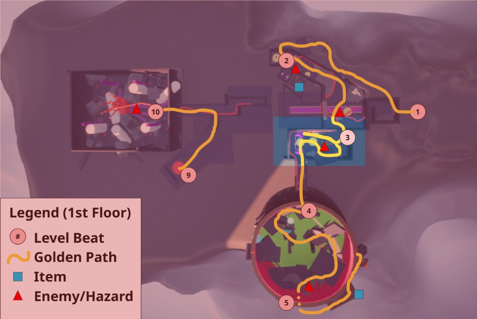

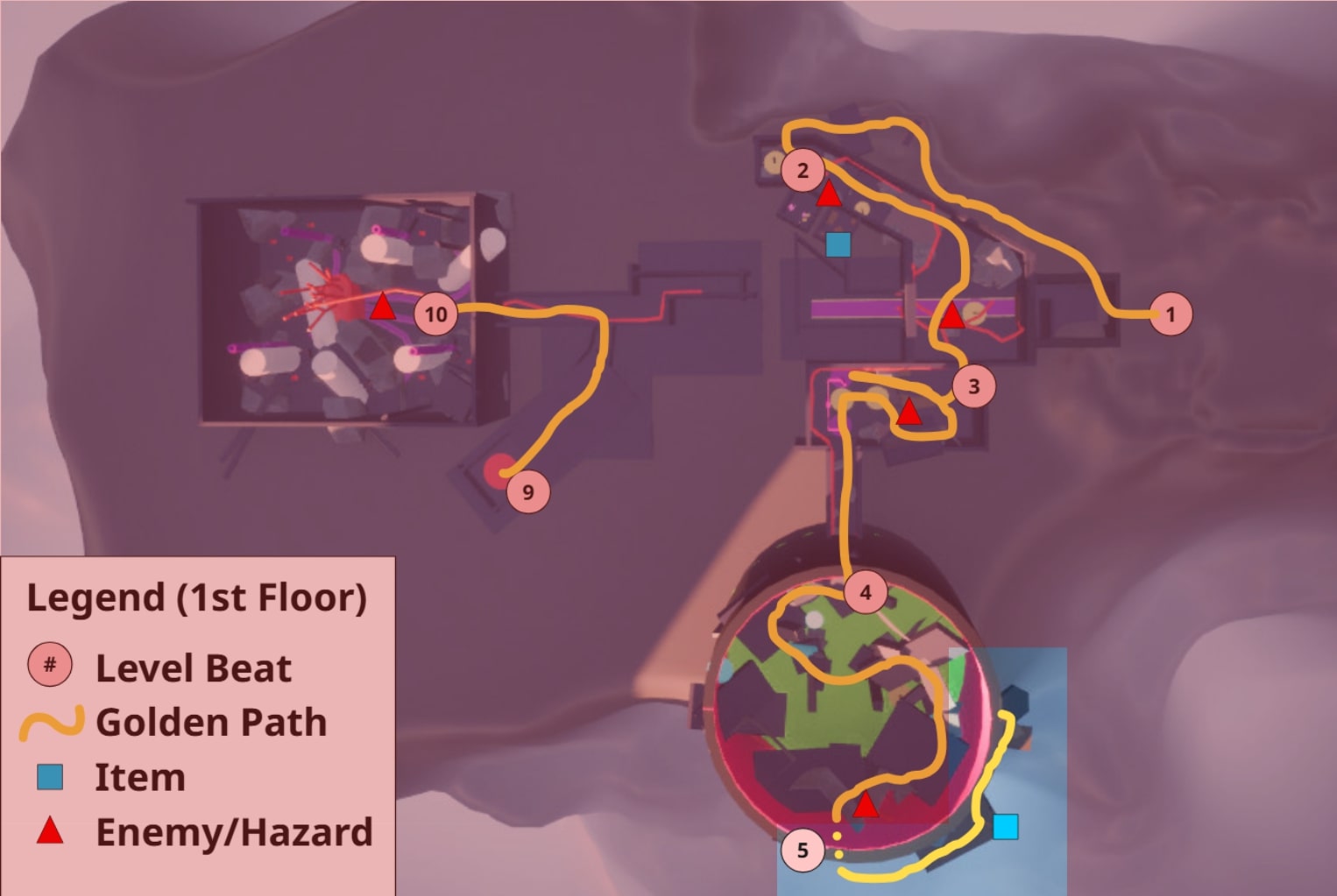

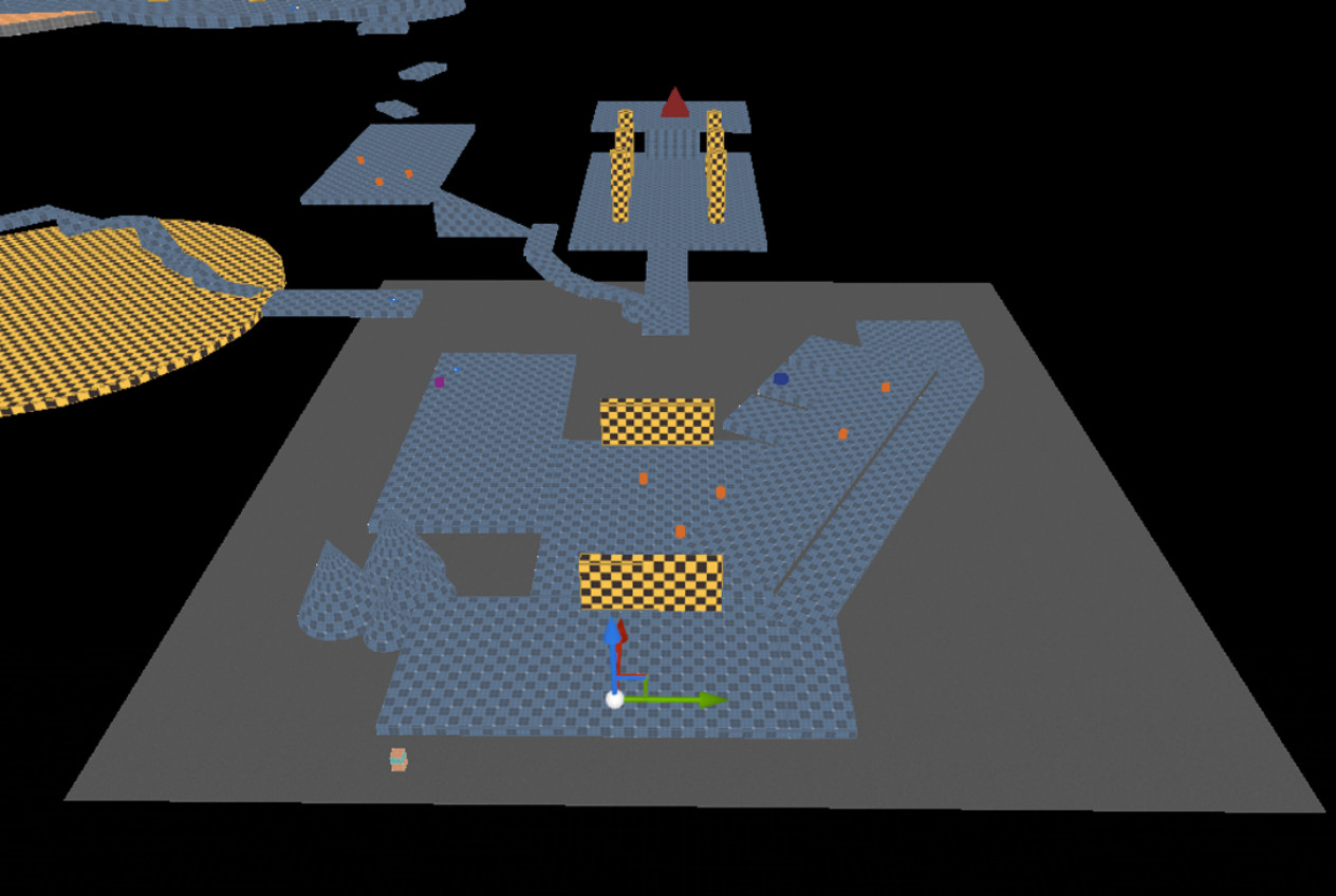
- The player begins outside the castle.
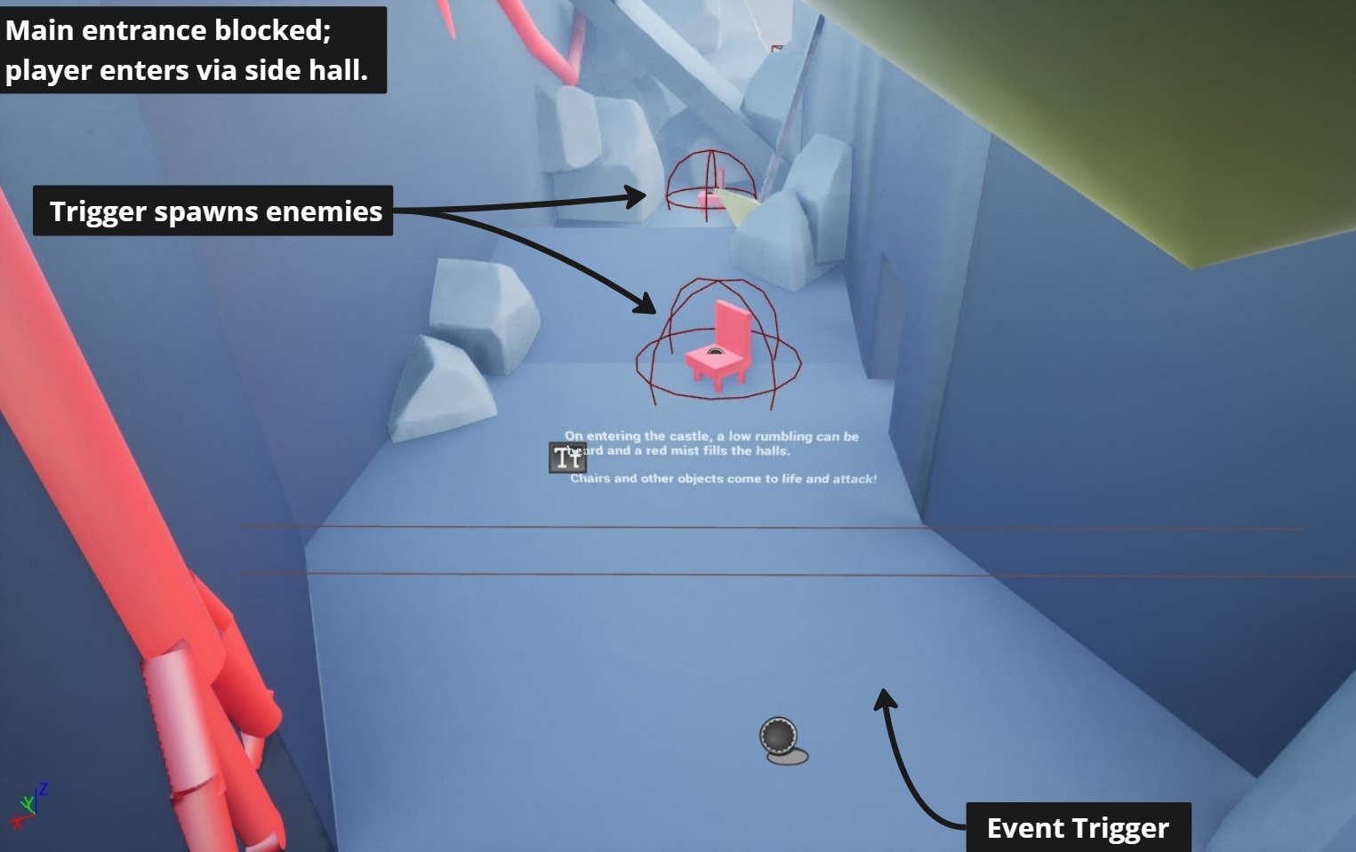
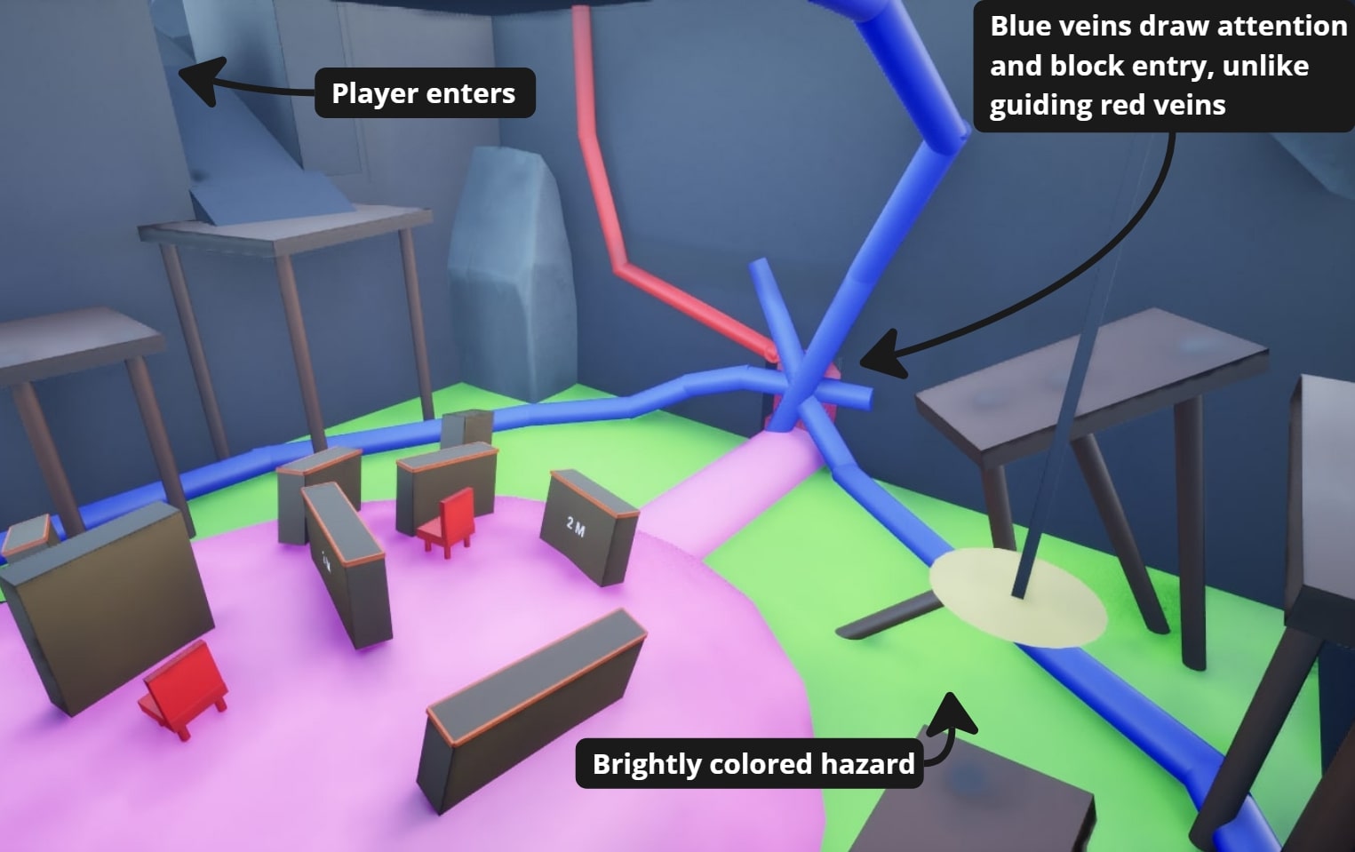
- Hazard blocks the main entrance.
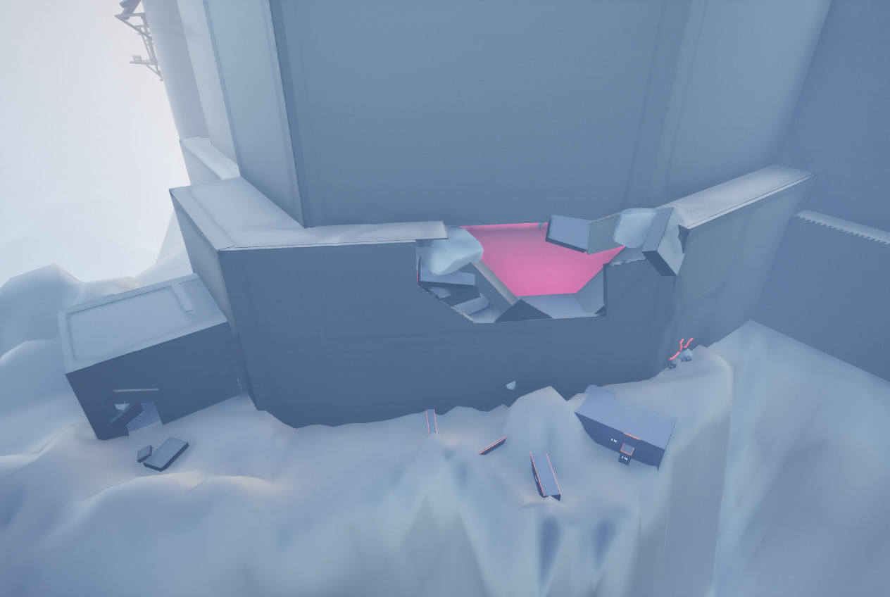
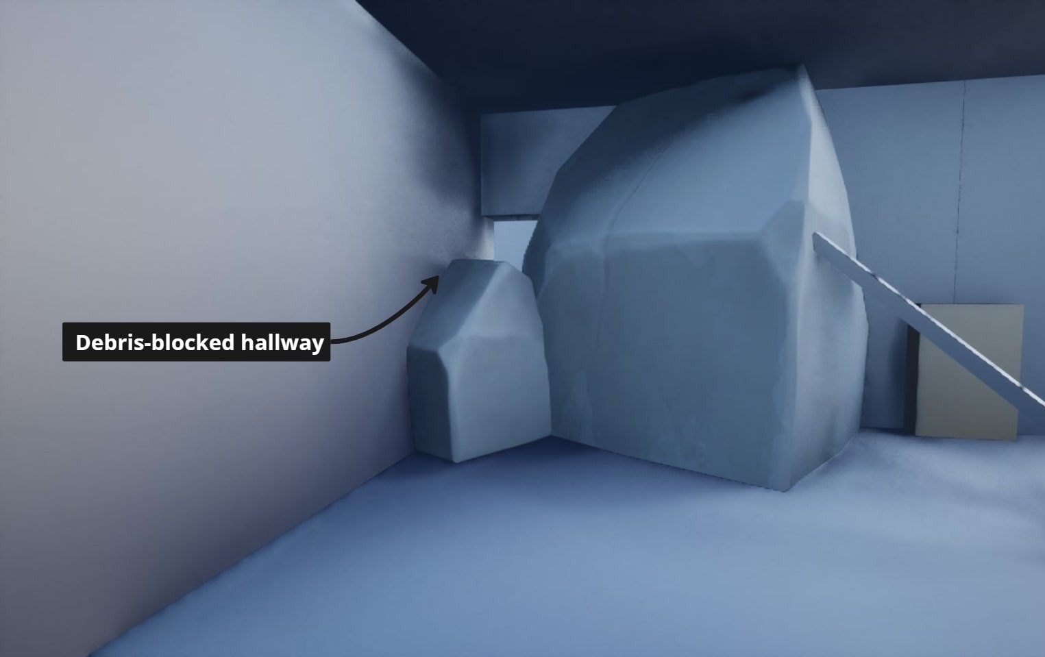
- A broken wall on the right cliff offers a way in.
- The player explores the castle’s first-floor.
- The living castle animates furniture to attack.
- Throne room blocked, but a dining hall is accessible nearby.
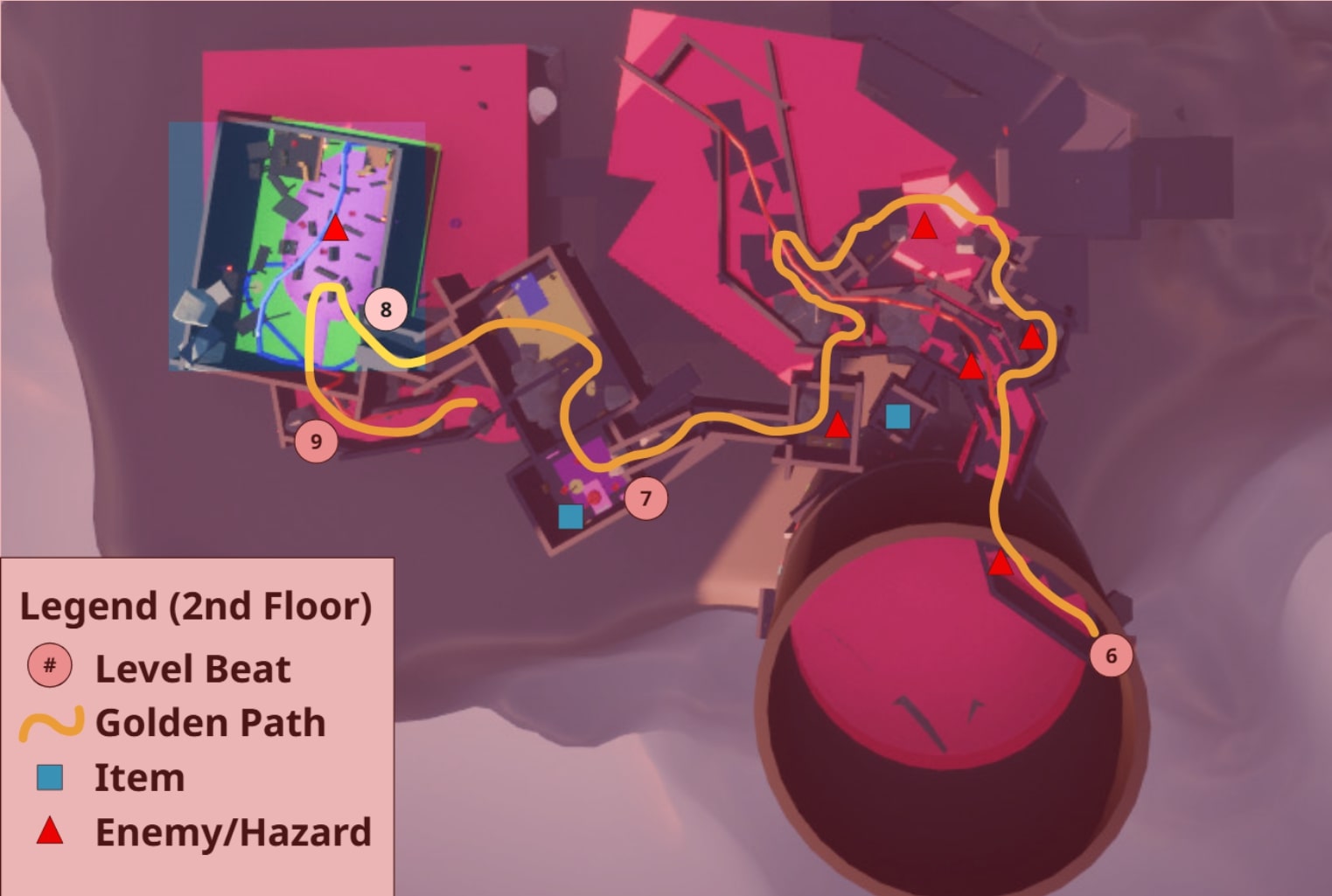
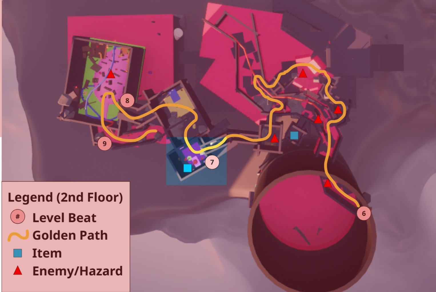
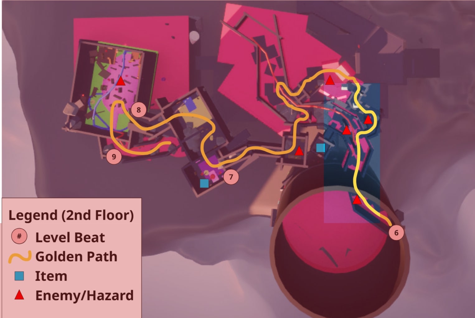
- The path to the kitchen is blocked by a raised floor.
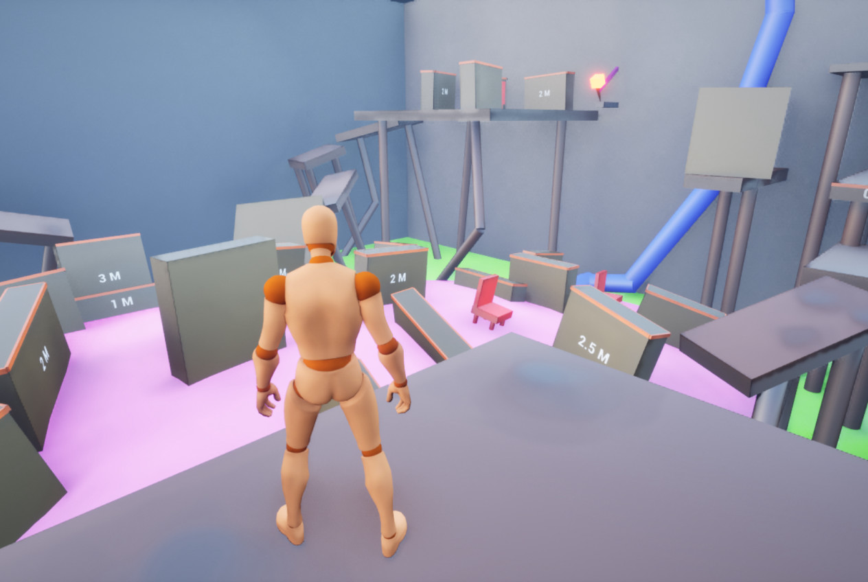
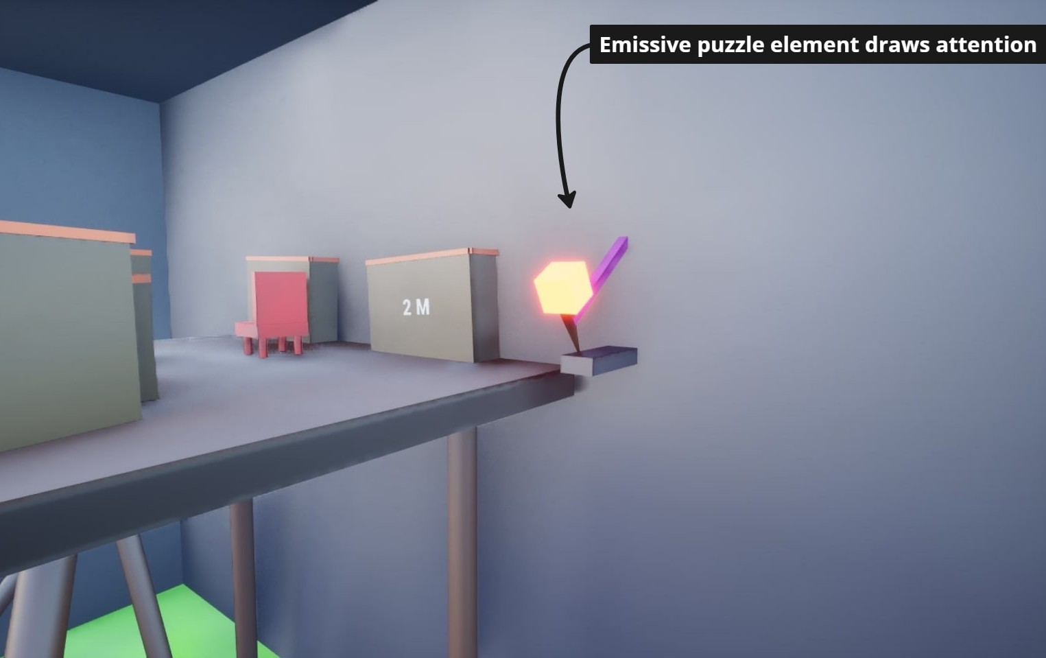
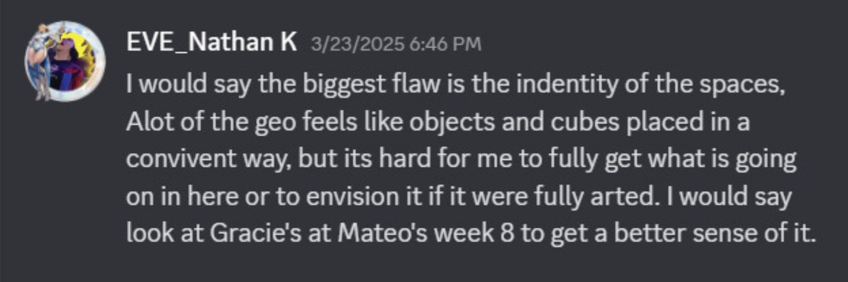
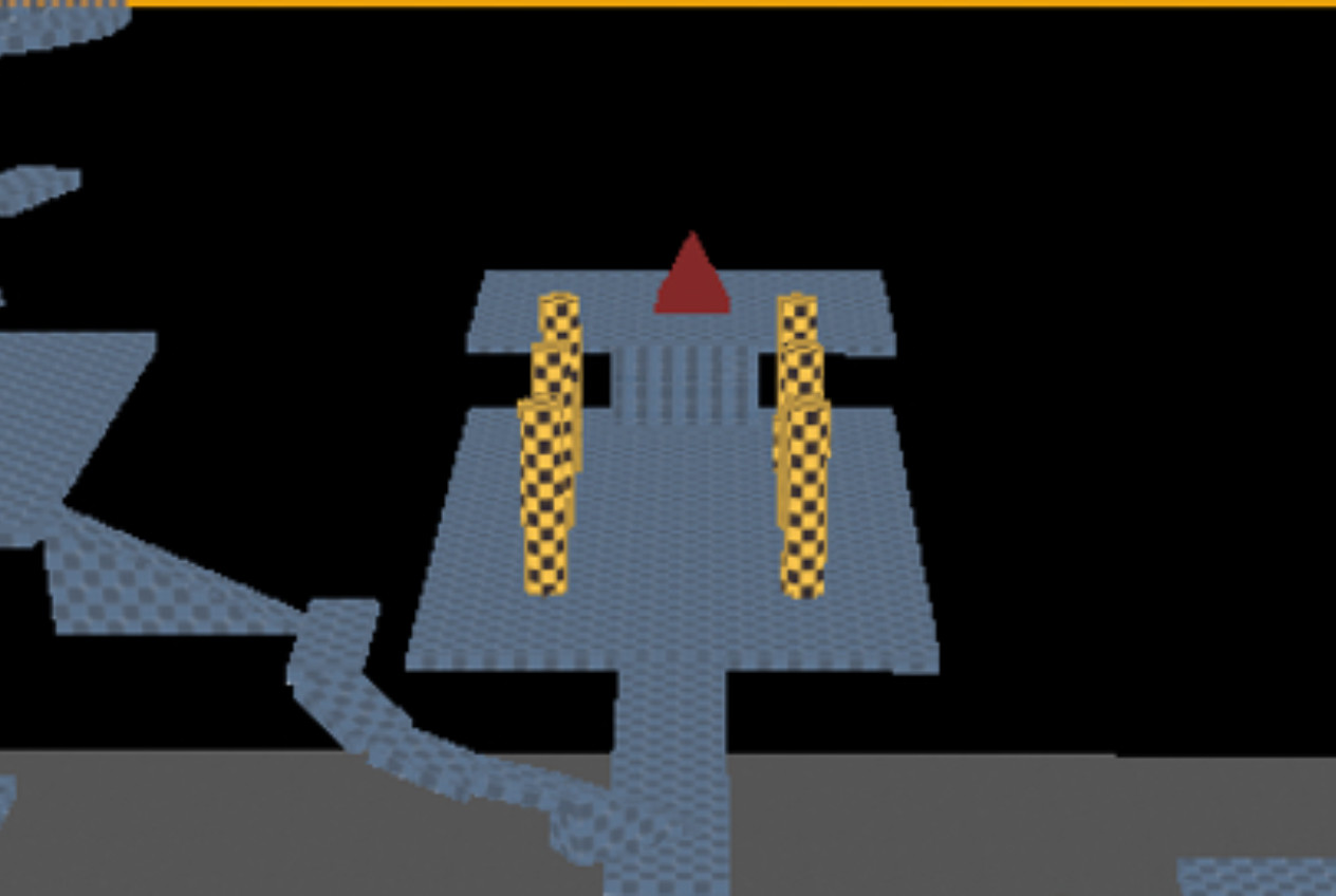
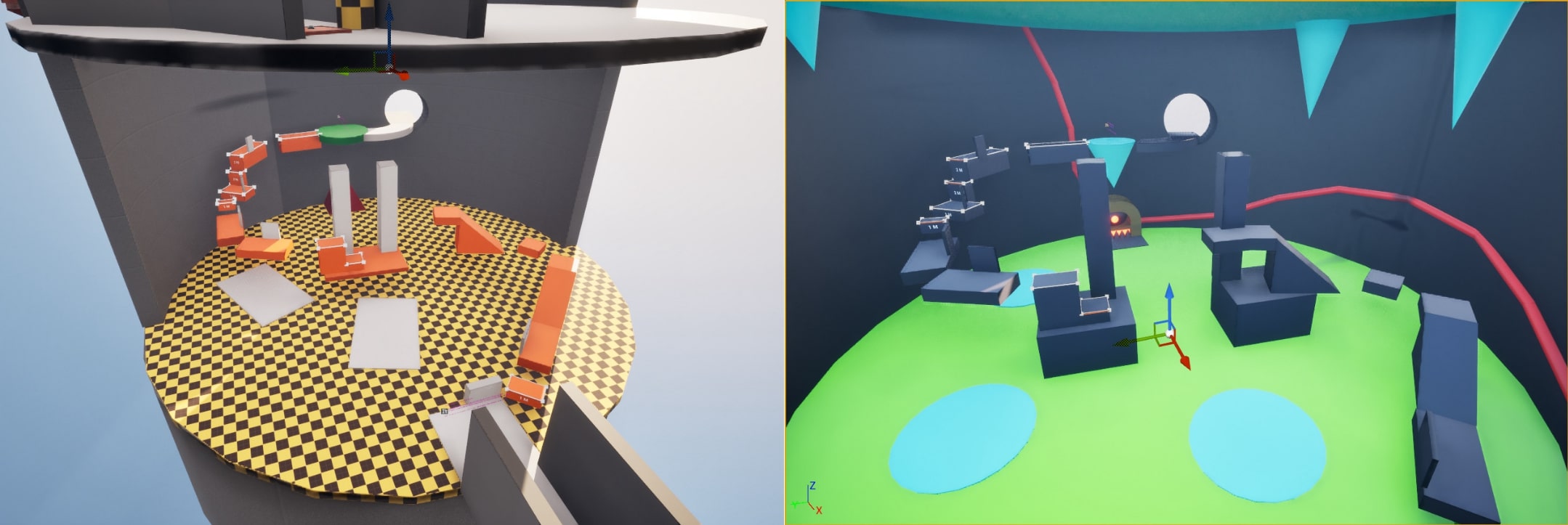
- The player must solve a weight puzzle using defeated enemies to proceed.
- Entering the kitchen starts an oven mini-boss fight.
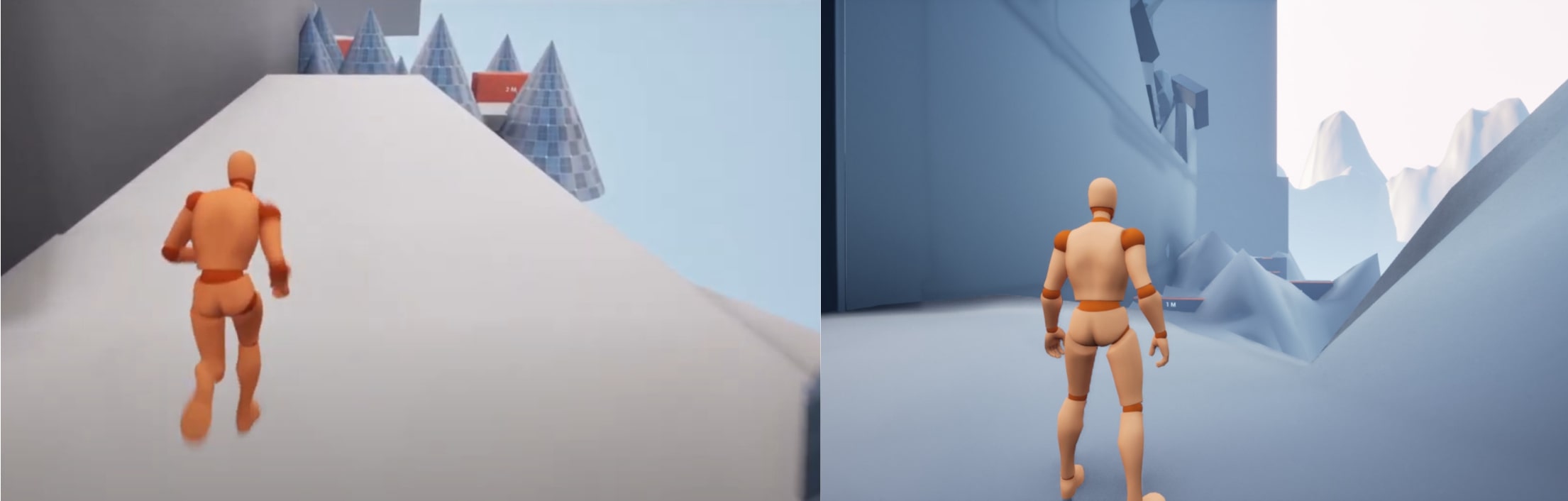
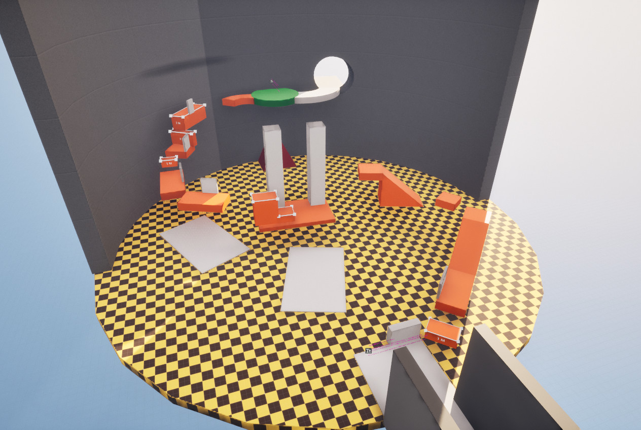
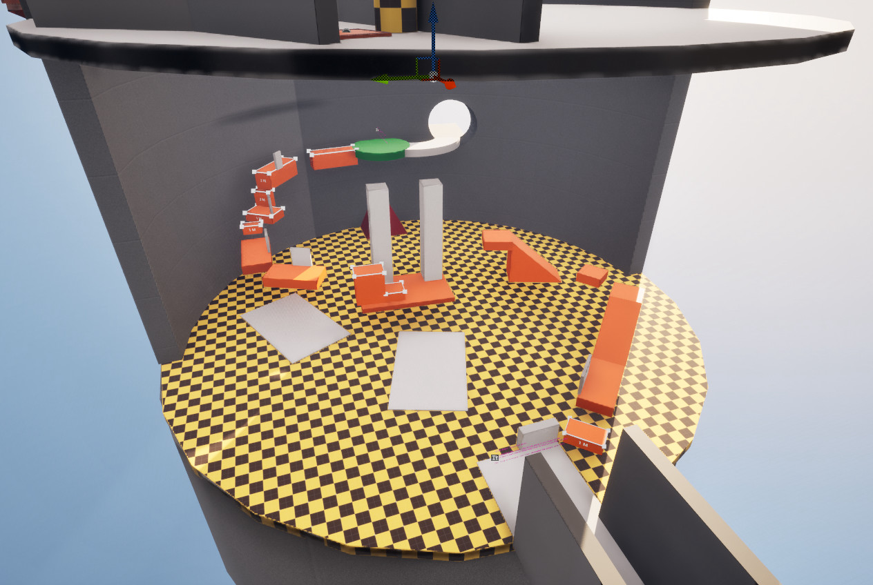
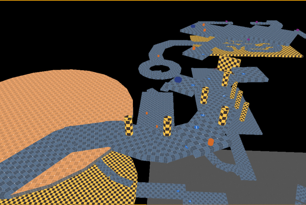
- The player dodges fire while platforming on broken castle parts.
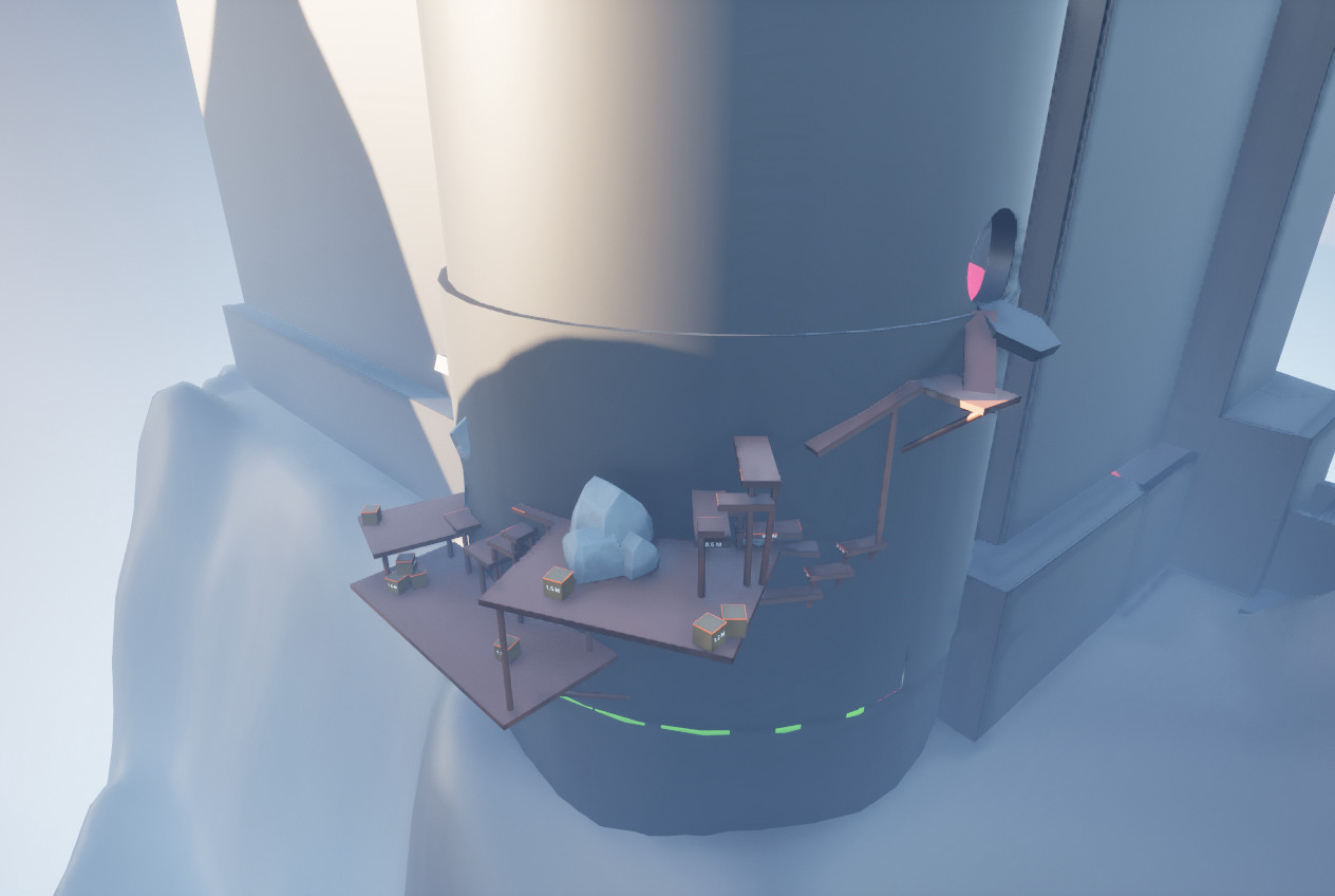
- Reaching the icicle platform.
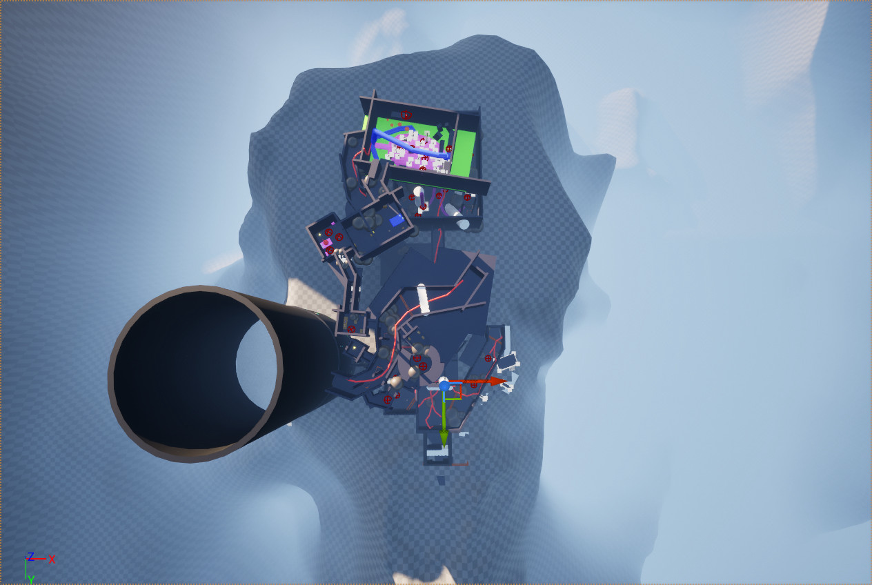
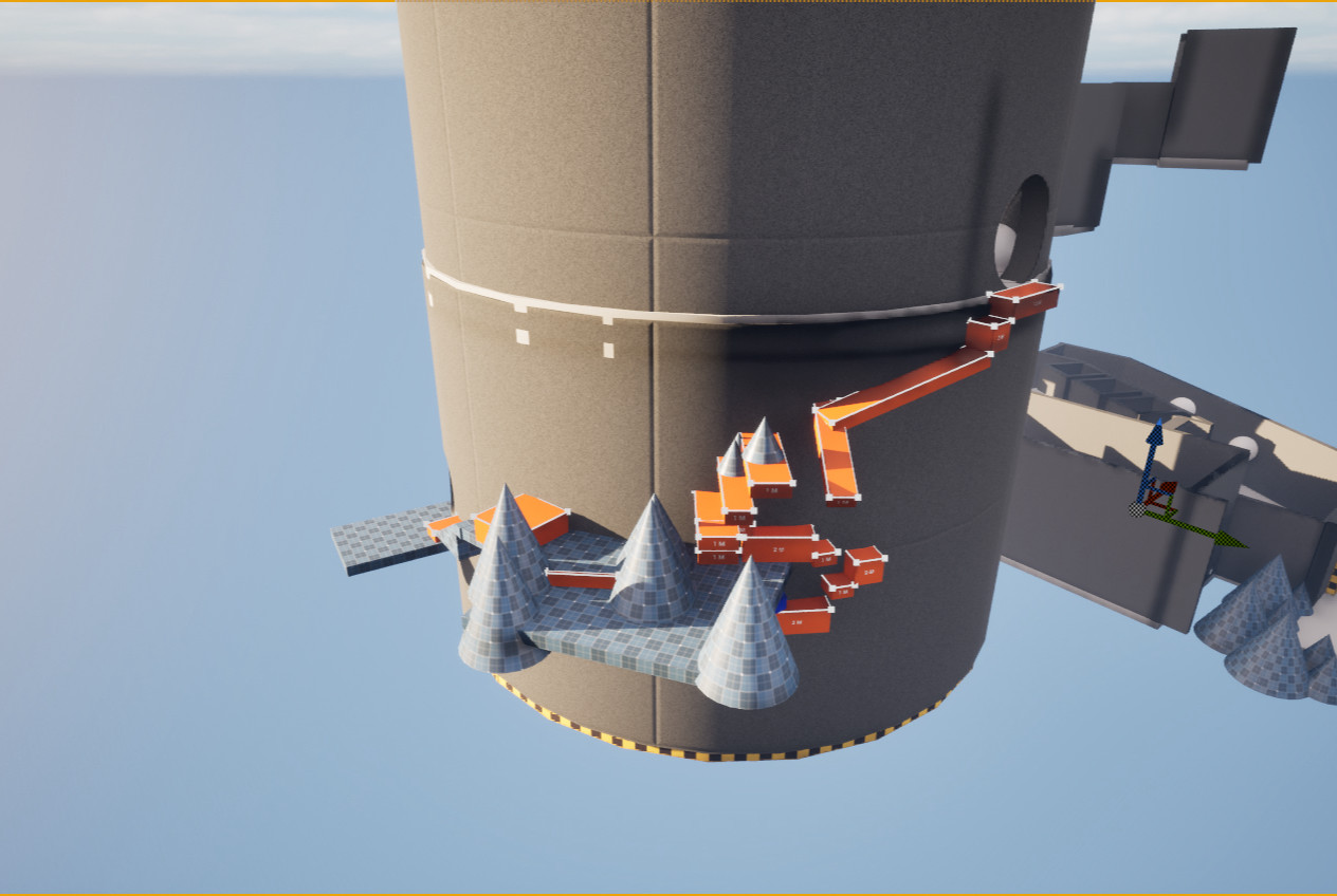
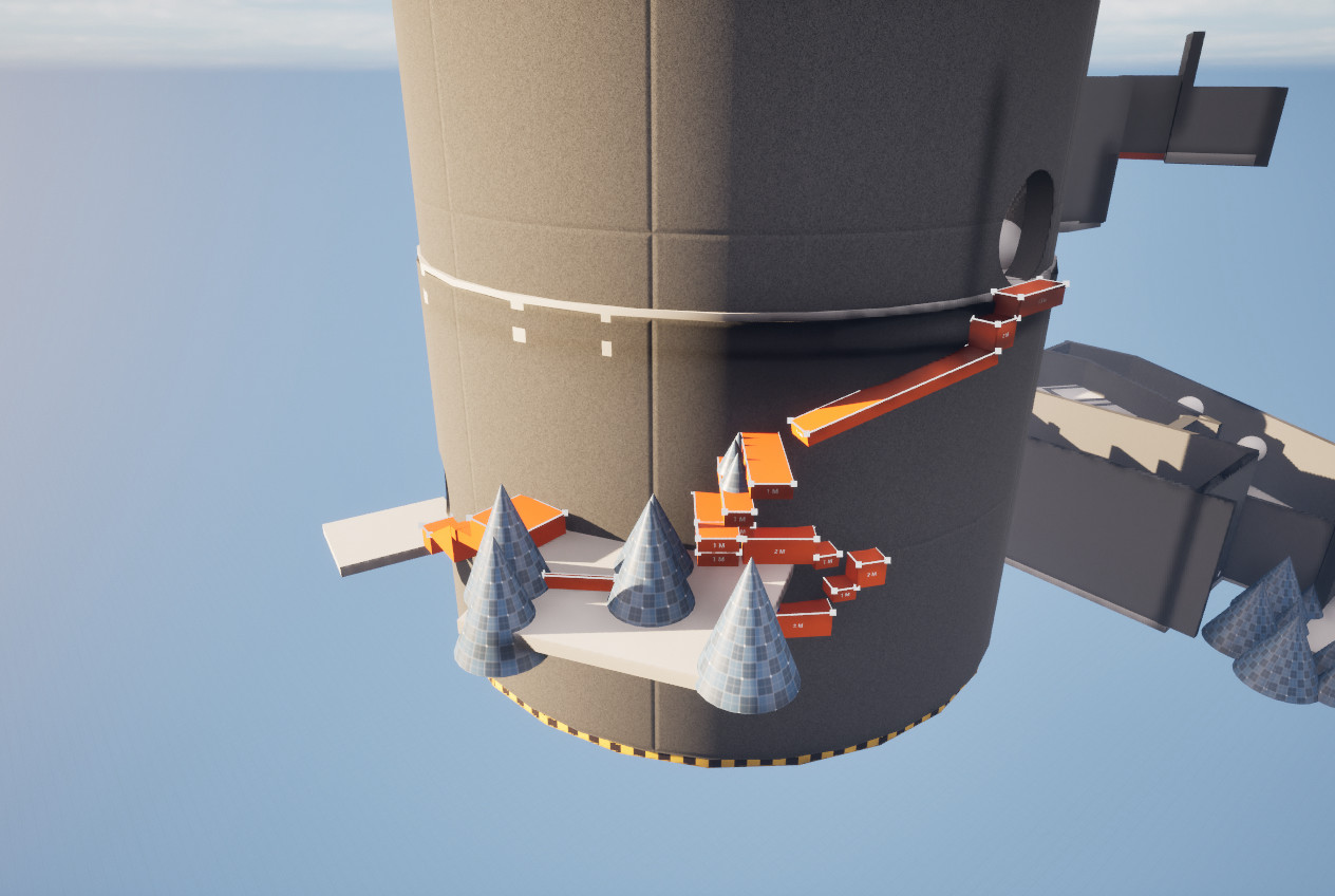
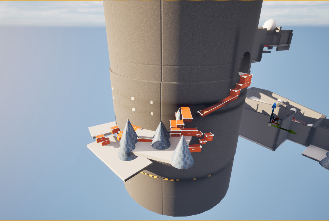
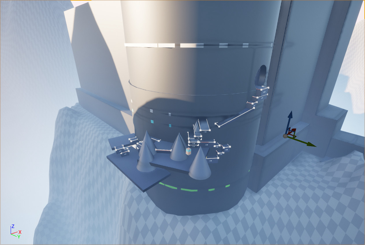
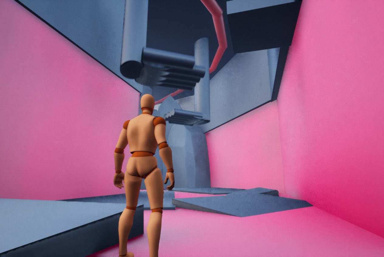
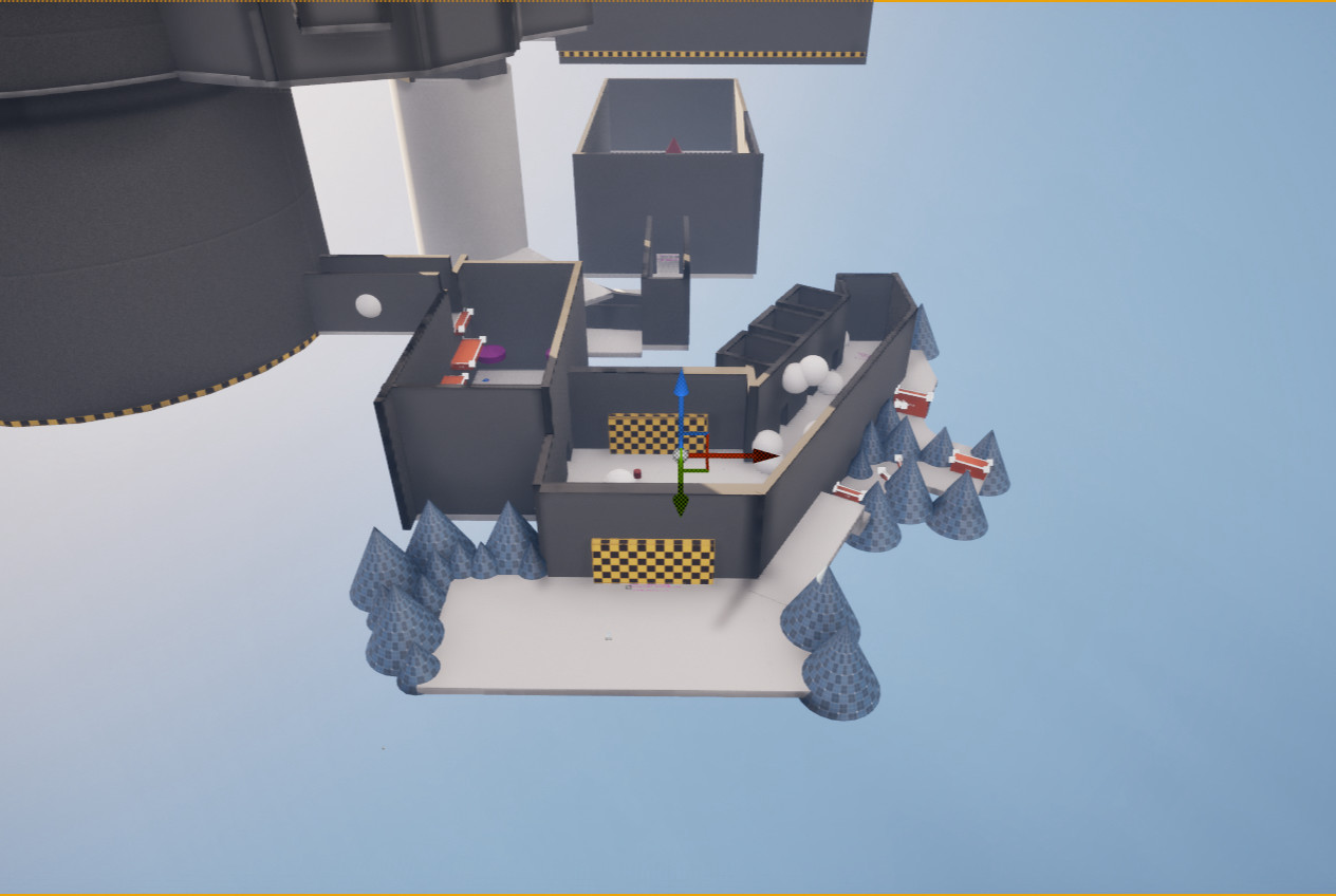
- Exiting the kitchen leads to a broken castle wall.
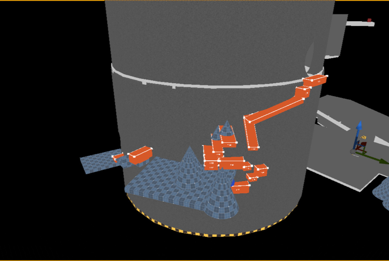
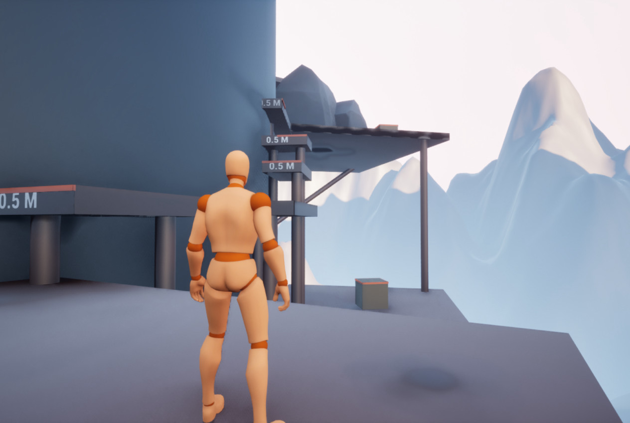
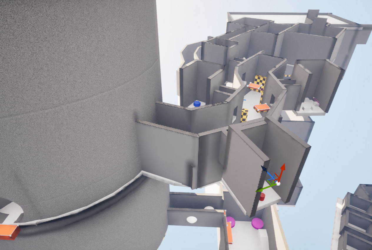
- The player must climb the outer wall to progress.
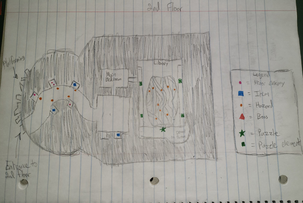
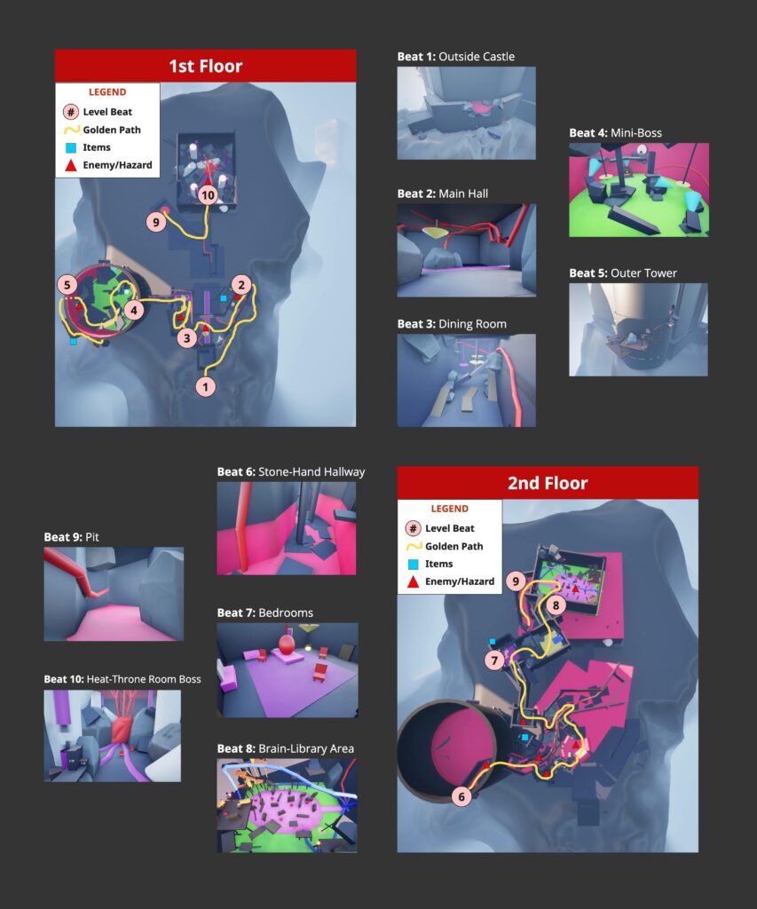
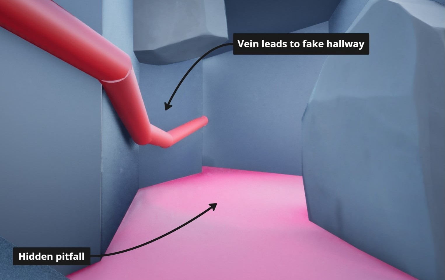
- The player re-enters through a high wall into a hallway.
- Stone hands slam down and serve as platforms.
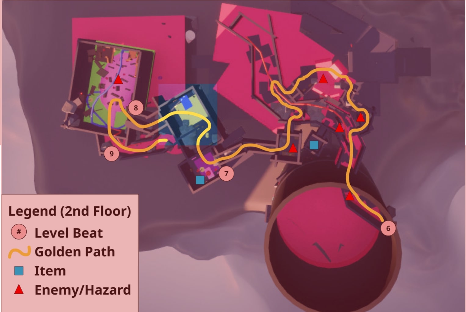
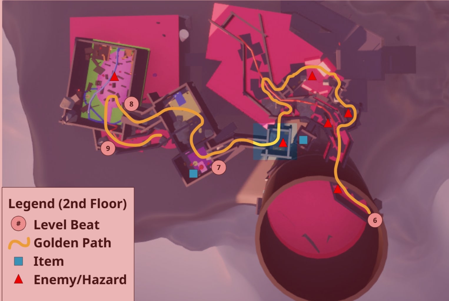
- The player must find the study to reach the bedrooms.
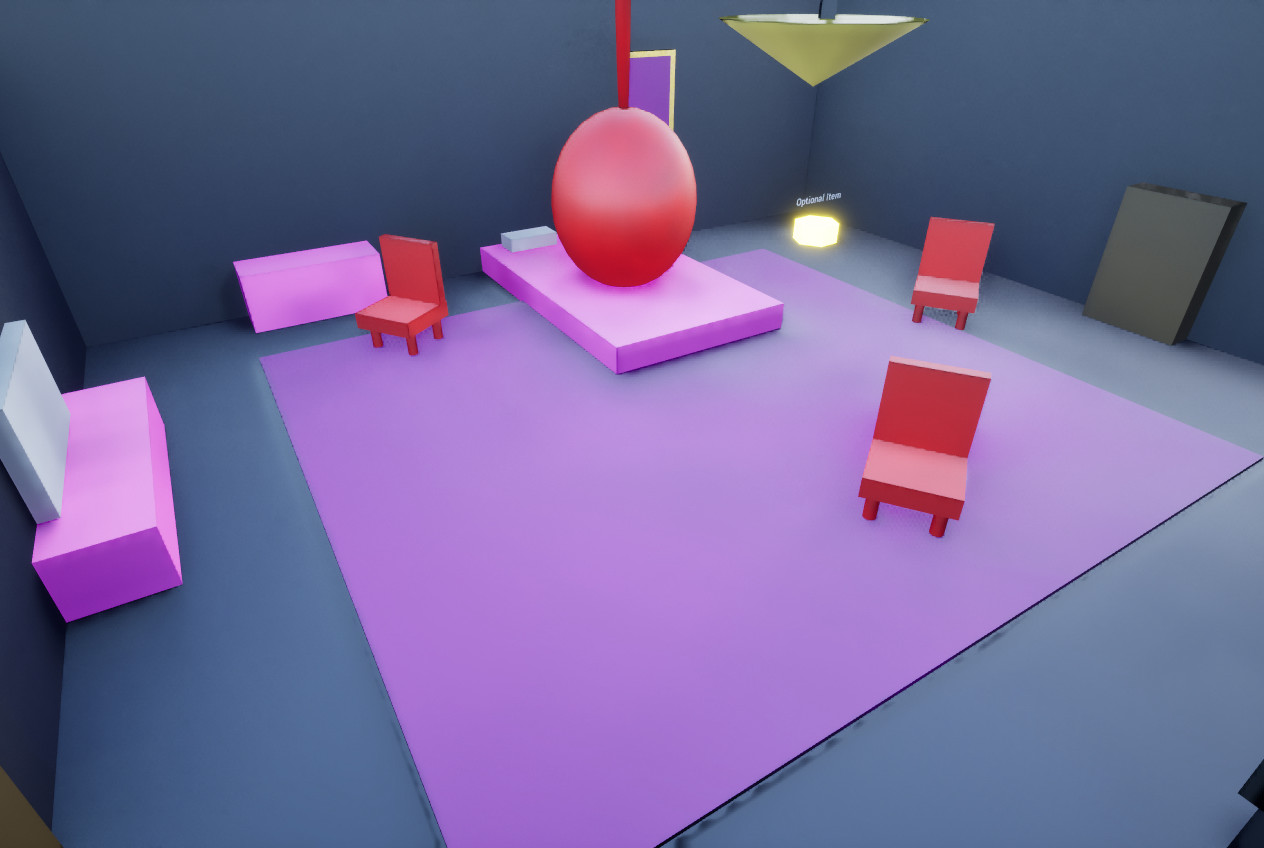
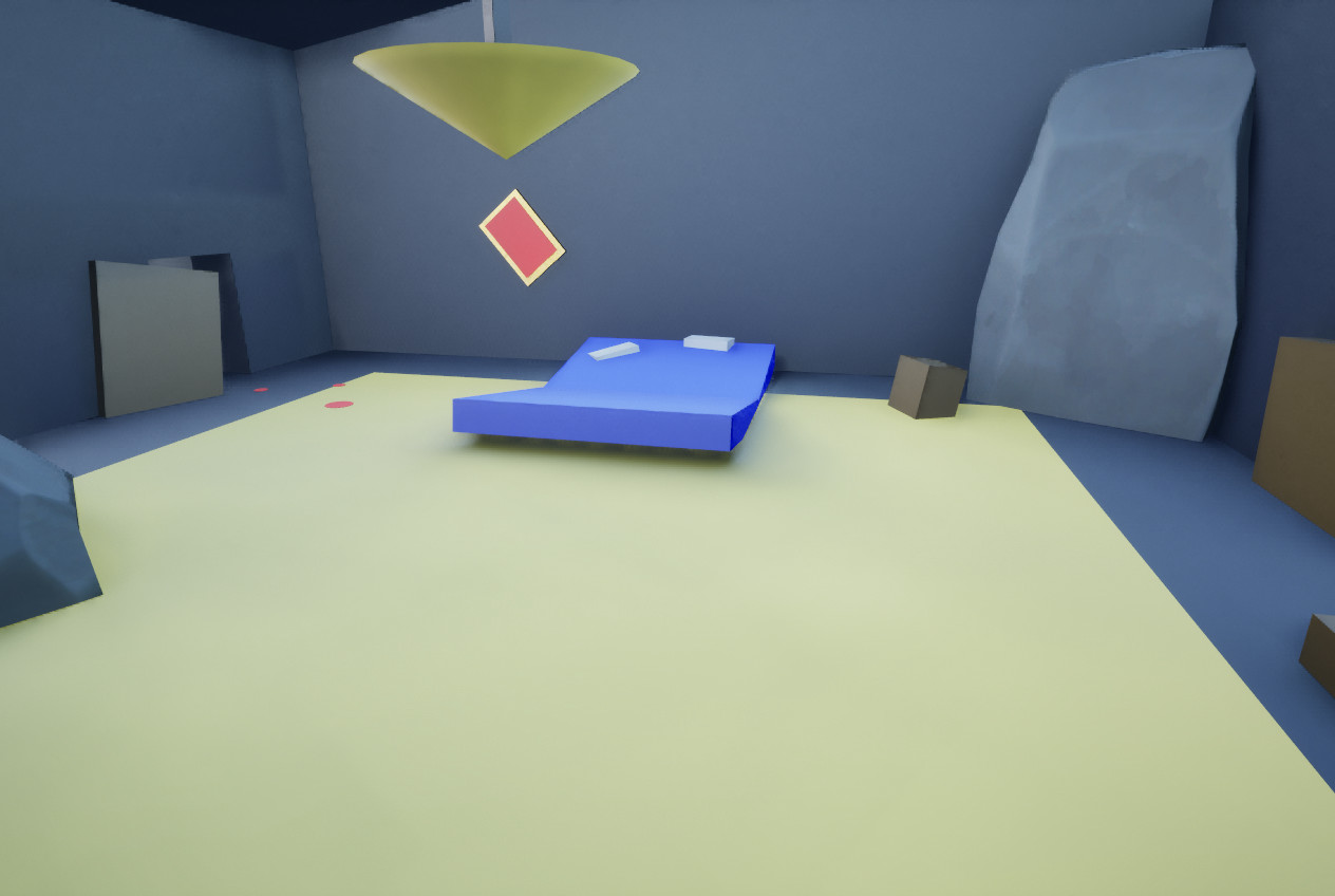
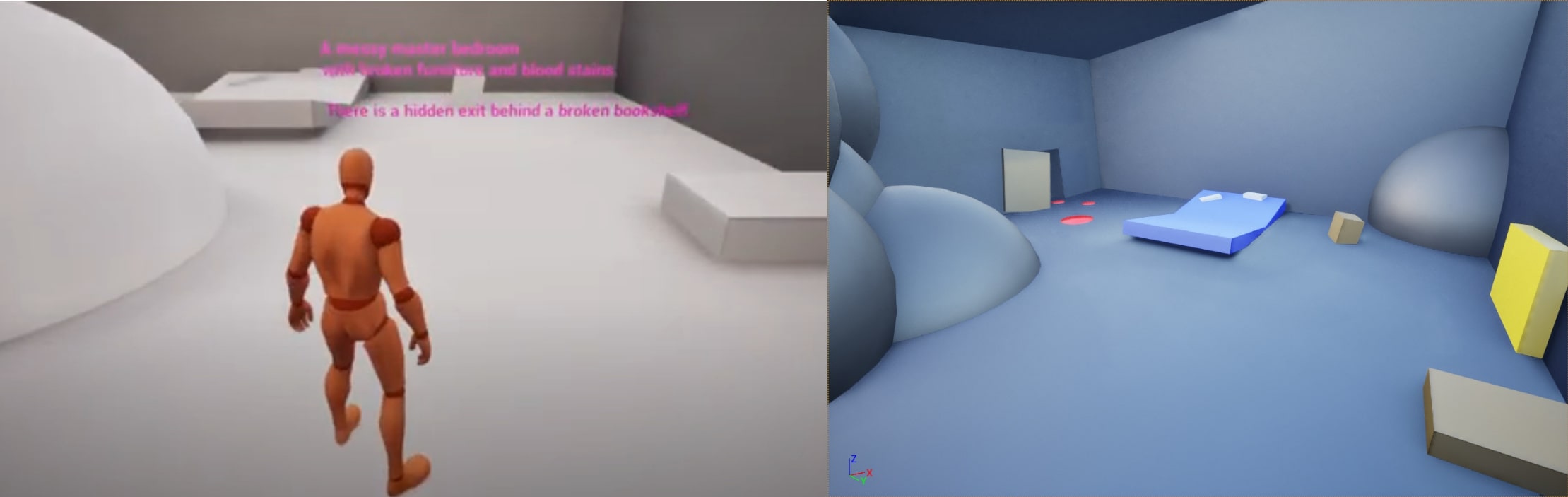
- Furniture enemies guard the daughter’s room; the parents’ room is in ruins.
- A hidden path behind a broken bookshelf leads to the Brain/Library.
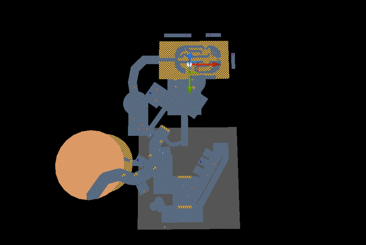
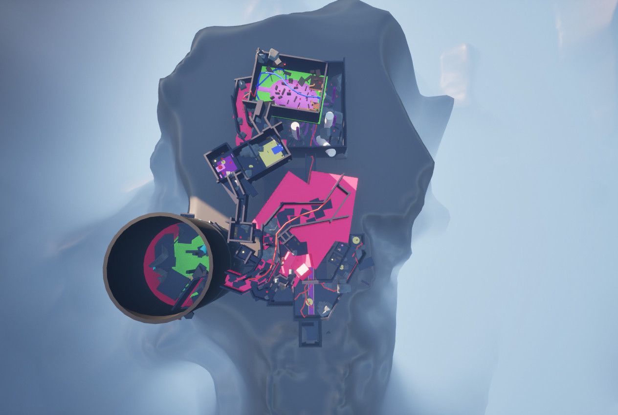
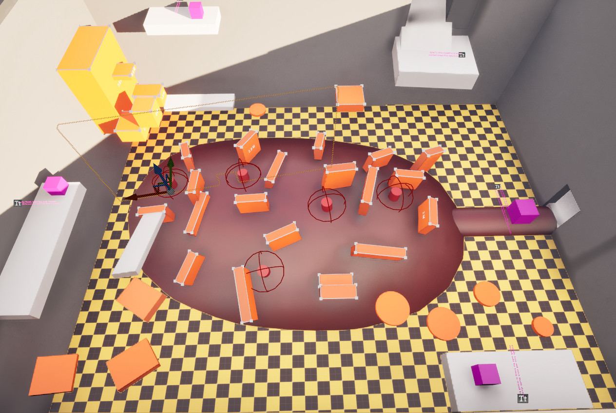
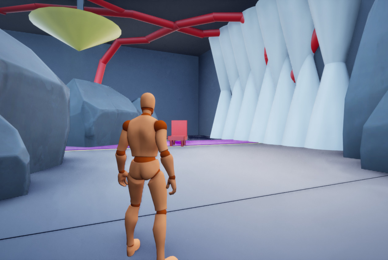
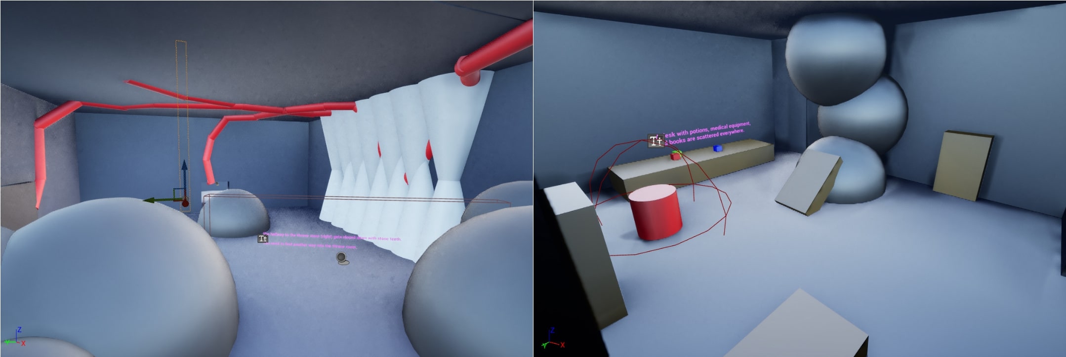
- A giant brain and hostile furniture fill the library.
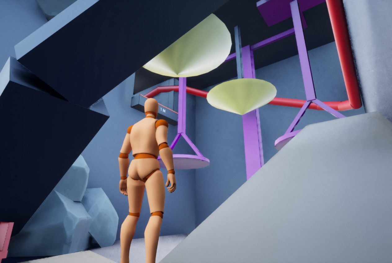
- Brain veins block the path.
- Cutting 3 torches burns the veins, clearing the way.
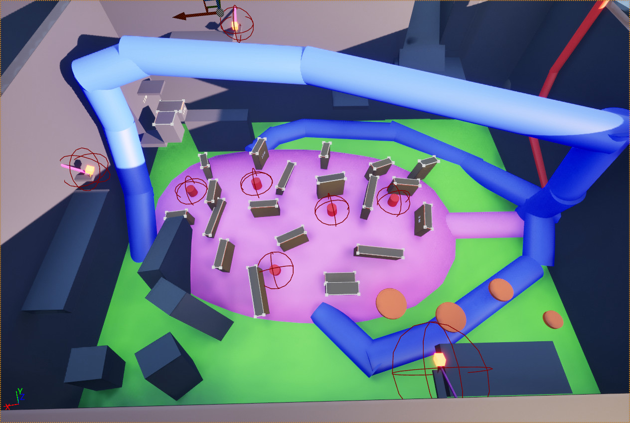
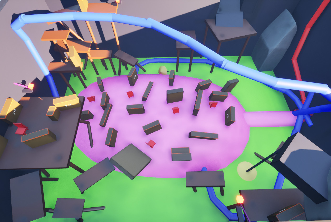
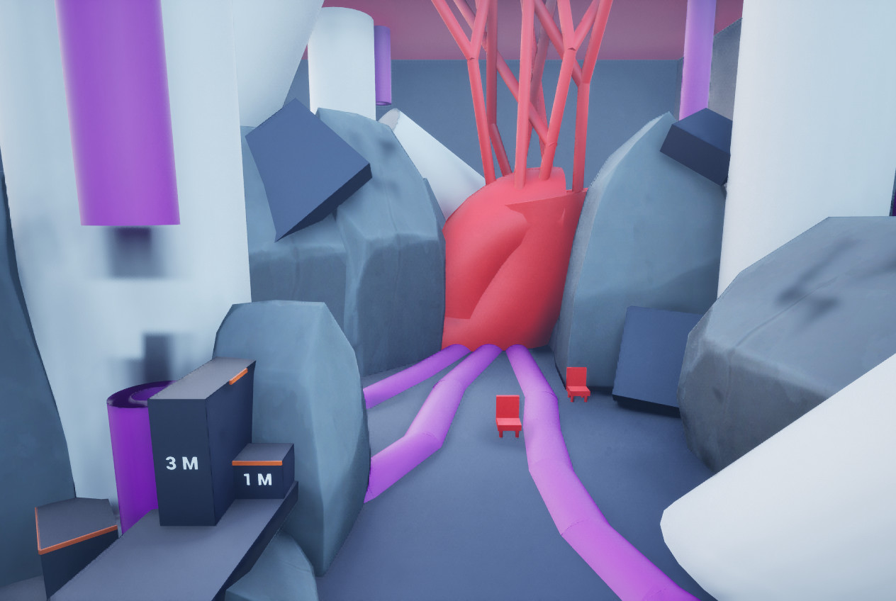
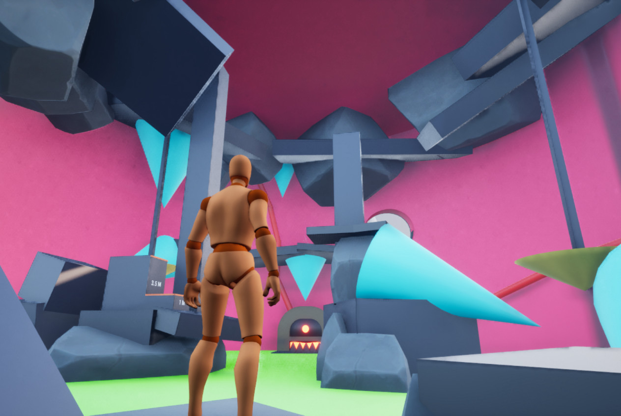
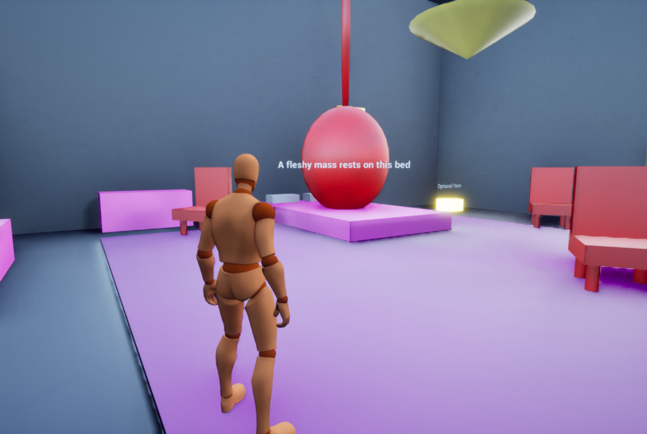
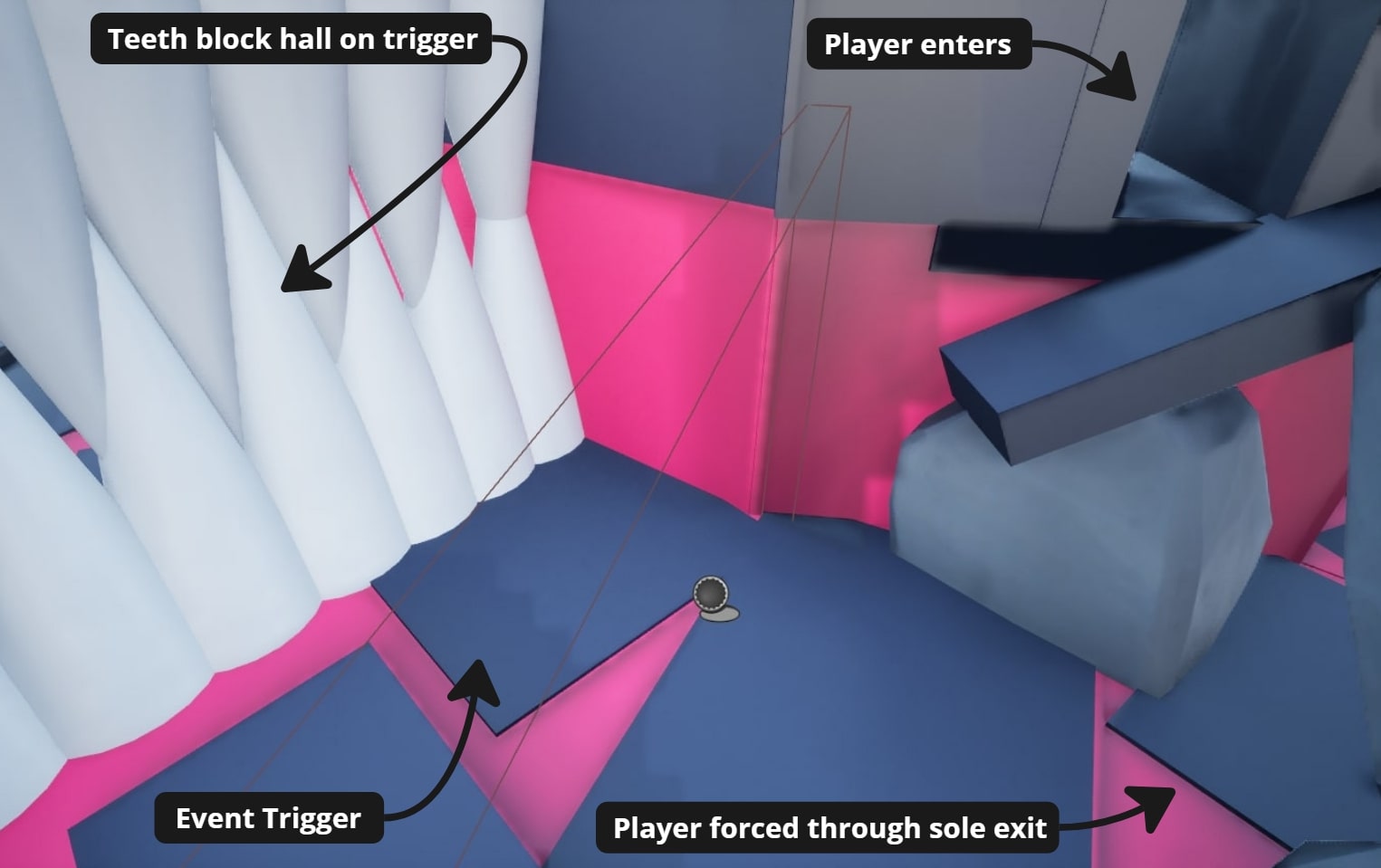
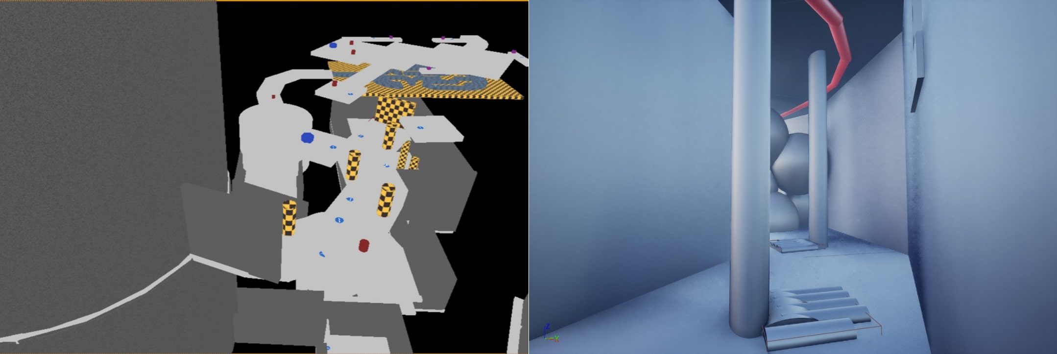
- The player follows a blood vein to a fleshy floor.
- A trap drops the player into a pit leading to the heart of the castle.
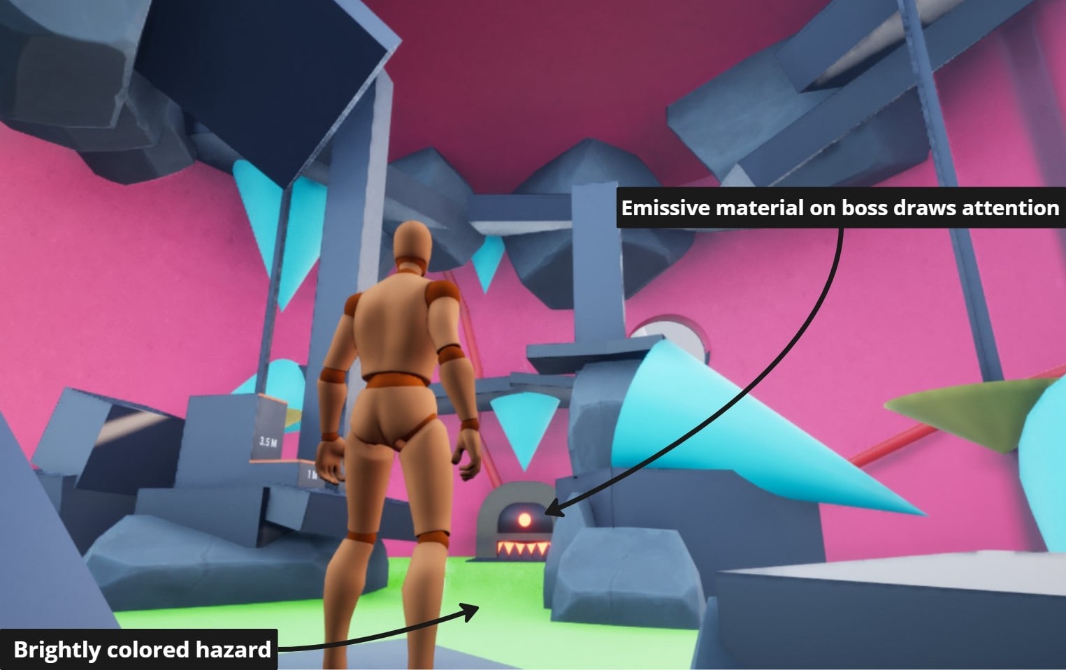
- The player battles the heart in the throne room, dodging blood blobs and fighting furniture enemies.
- To defeat the boss, they must clog 4 veins with enemies.
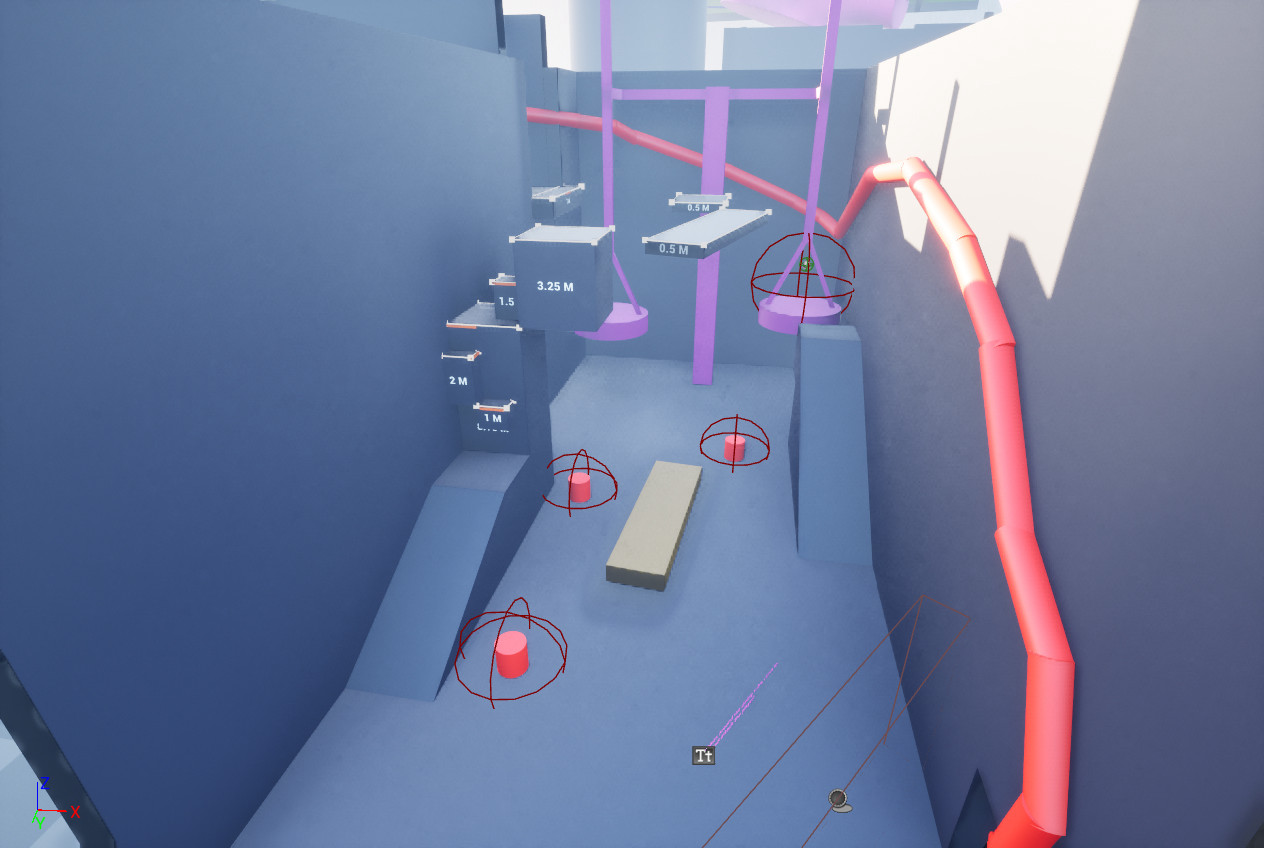

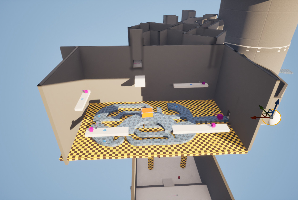
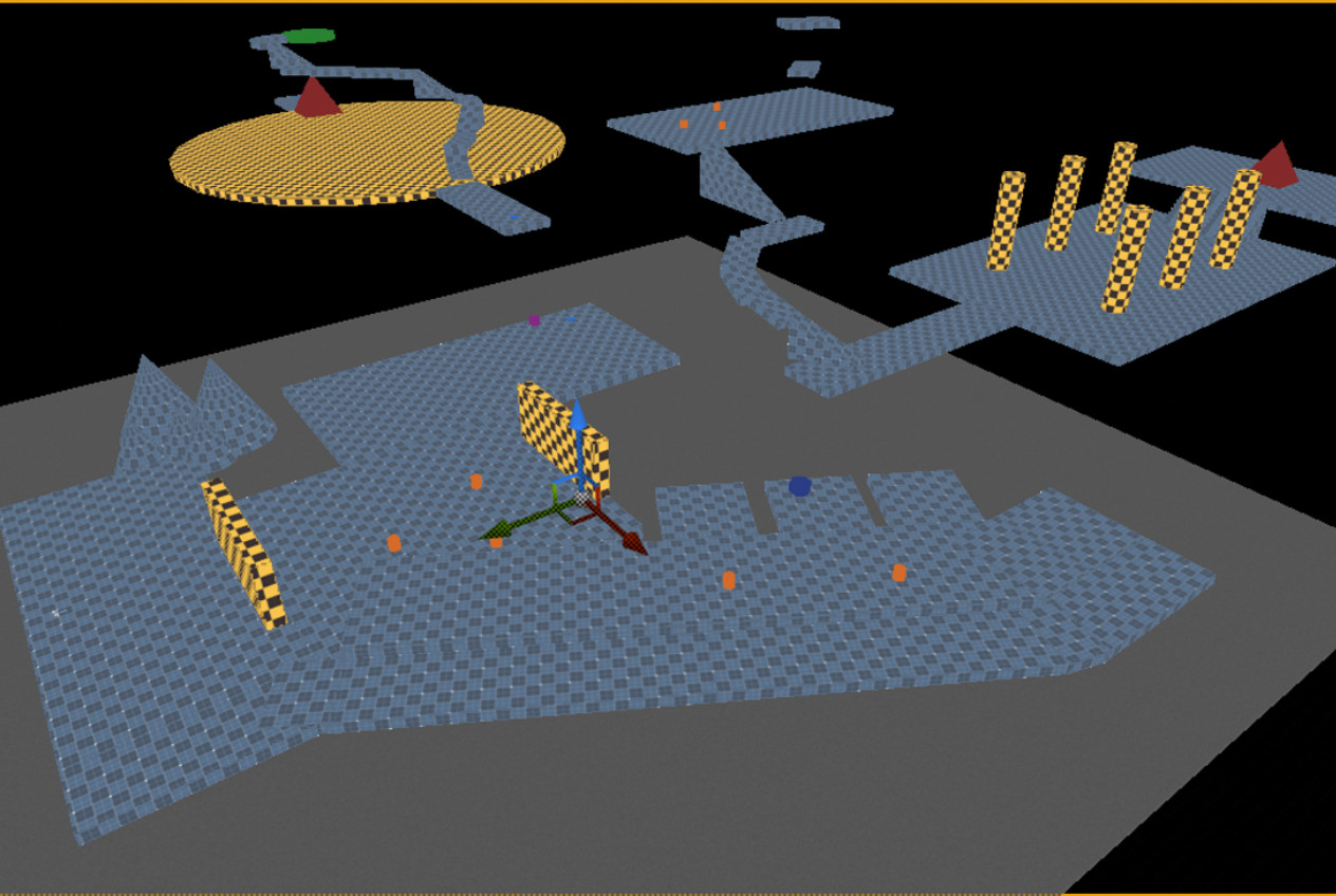
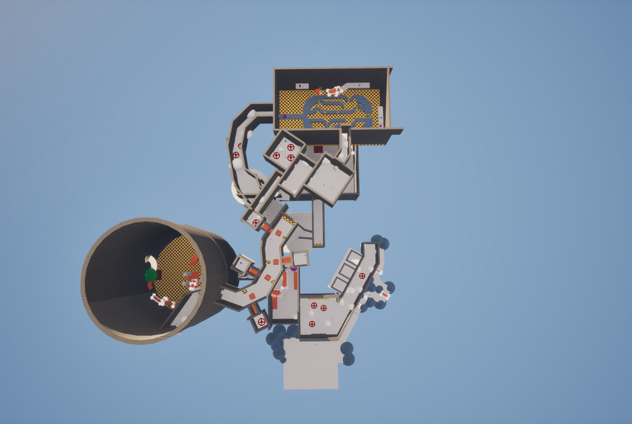
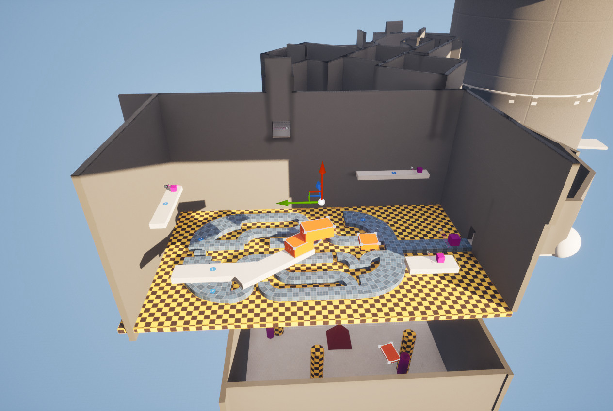
Adjusted kitchen and tower platforming because certain areas were unfair for players to jump on.

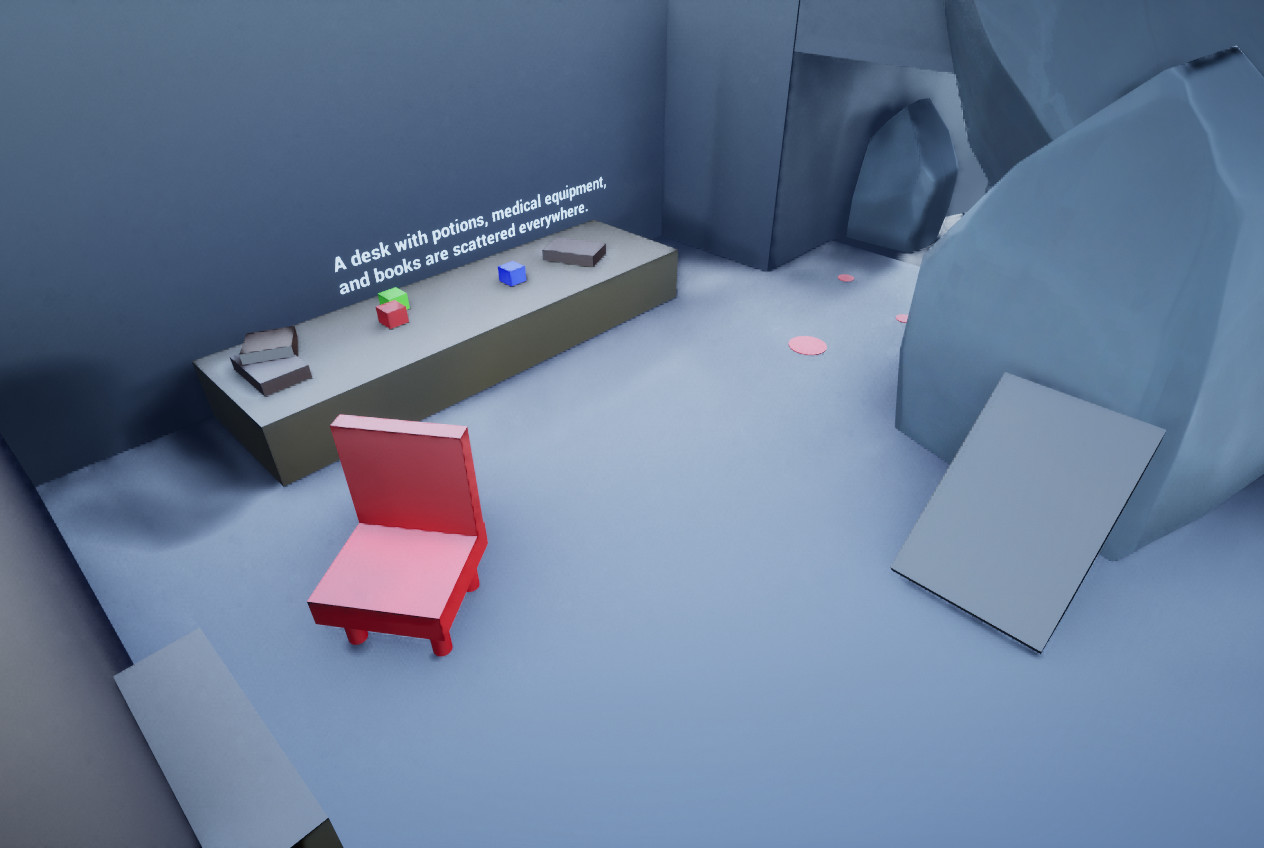
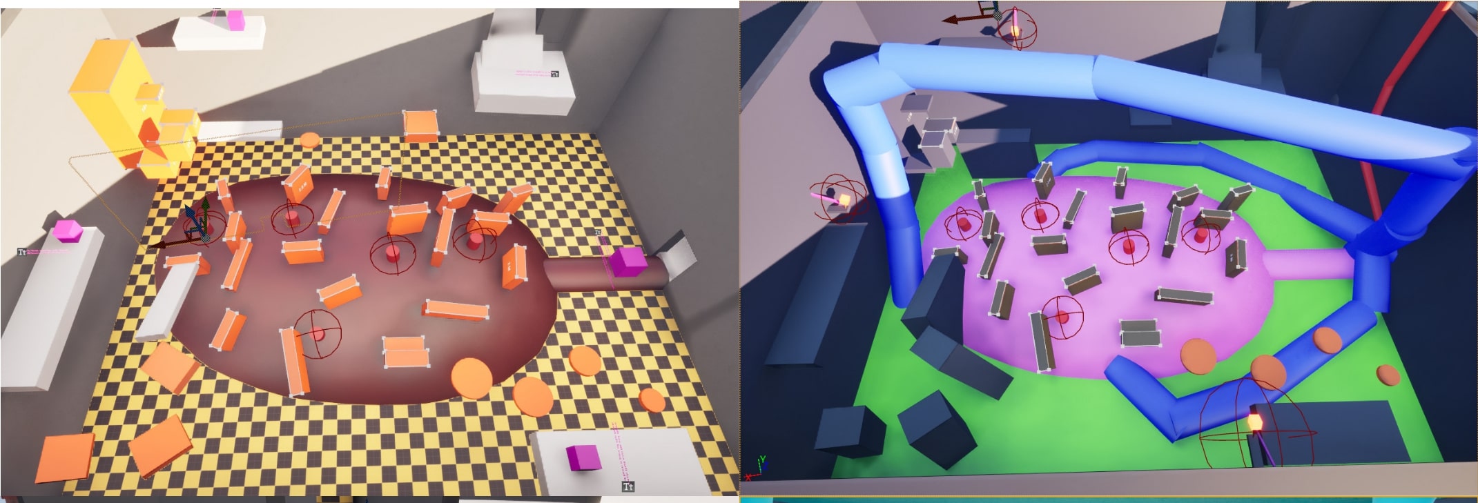
Added narrative text and props due to some game events and areas being unclear to players.
Replaced teleporters with moving platforms for the second-floor stone hands to clarify the hazard’s behavior and reduce player confusion.
Edited the parent bedroom to frame where the hidden exit is instead of directly telling the player to make them feel smarter for discovering it.
Made mandatory pitfall on the second floor a surprise instead of visible to engage the player further.
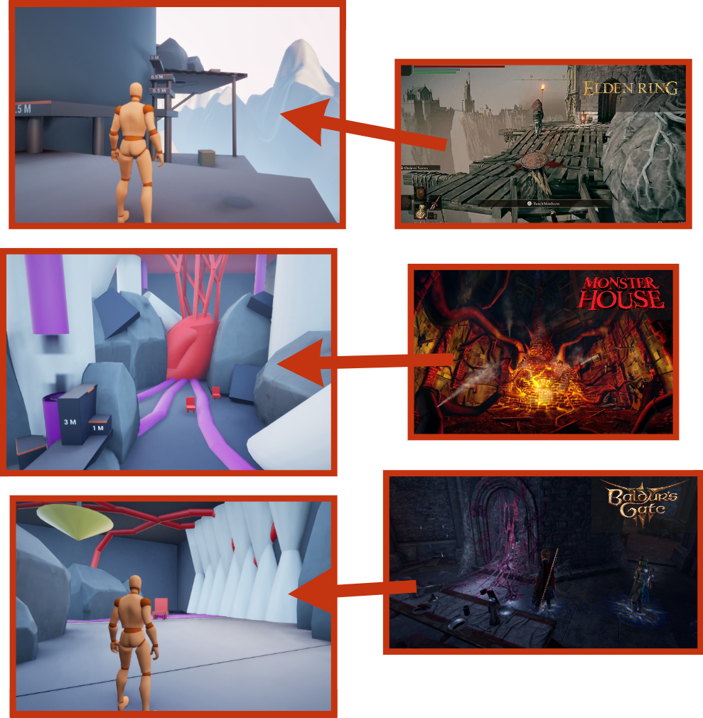
Edited directional lighting and skybox to be darker with cooler colors to better communicate to the player the mood and tone of the level.
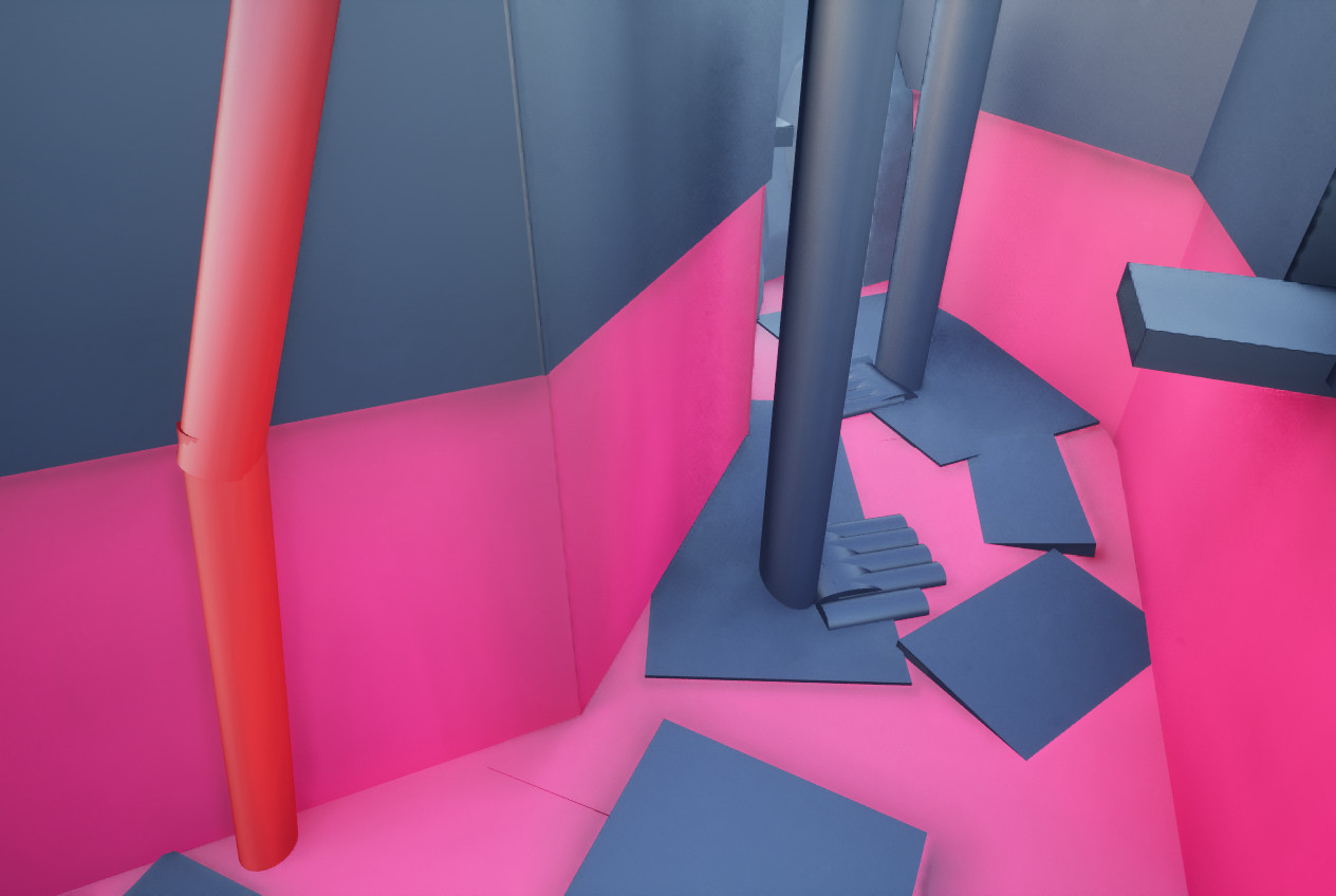
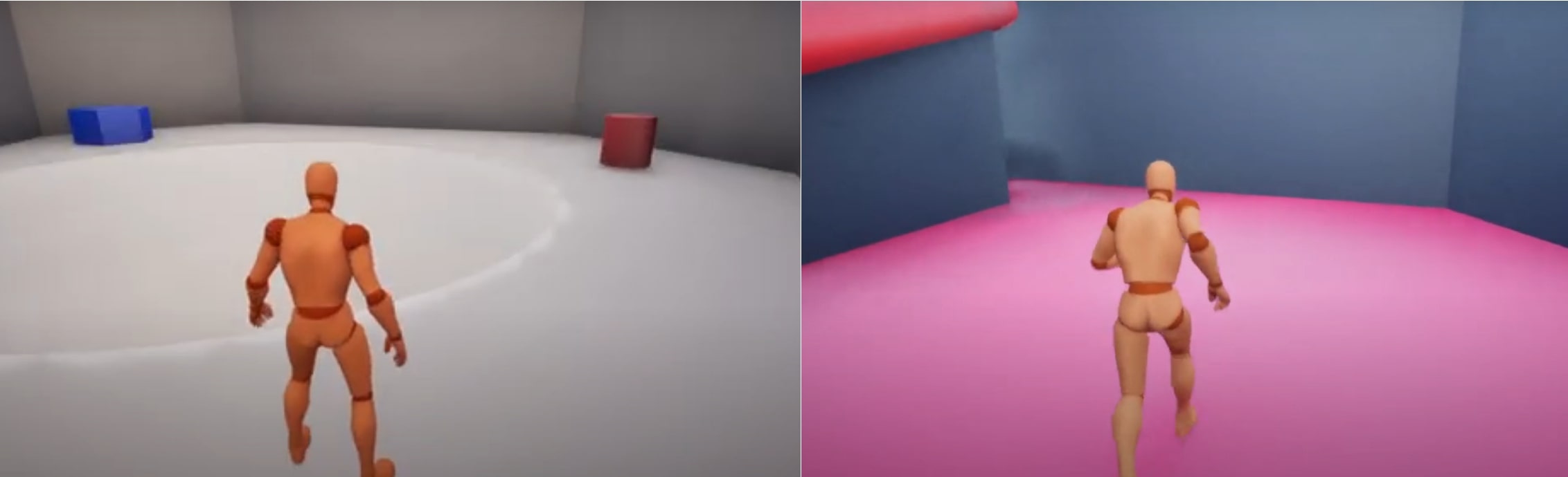
Changed object material colors throughout the level to communicate danger to the player more efficiently.
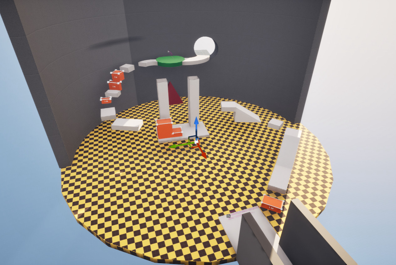
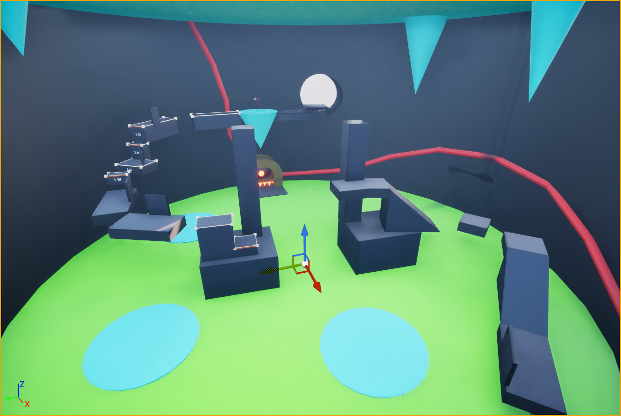
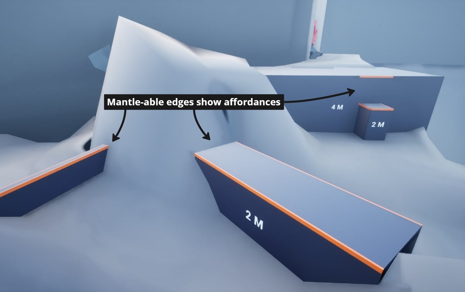
Due to player confusion, all platforms that require jumping or mantling were changed to Orange to clarify their affordance.

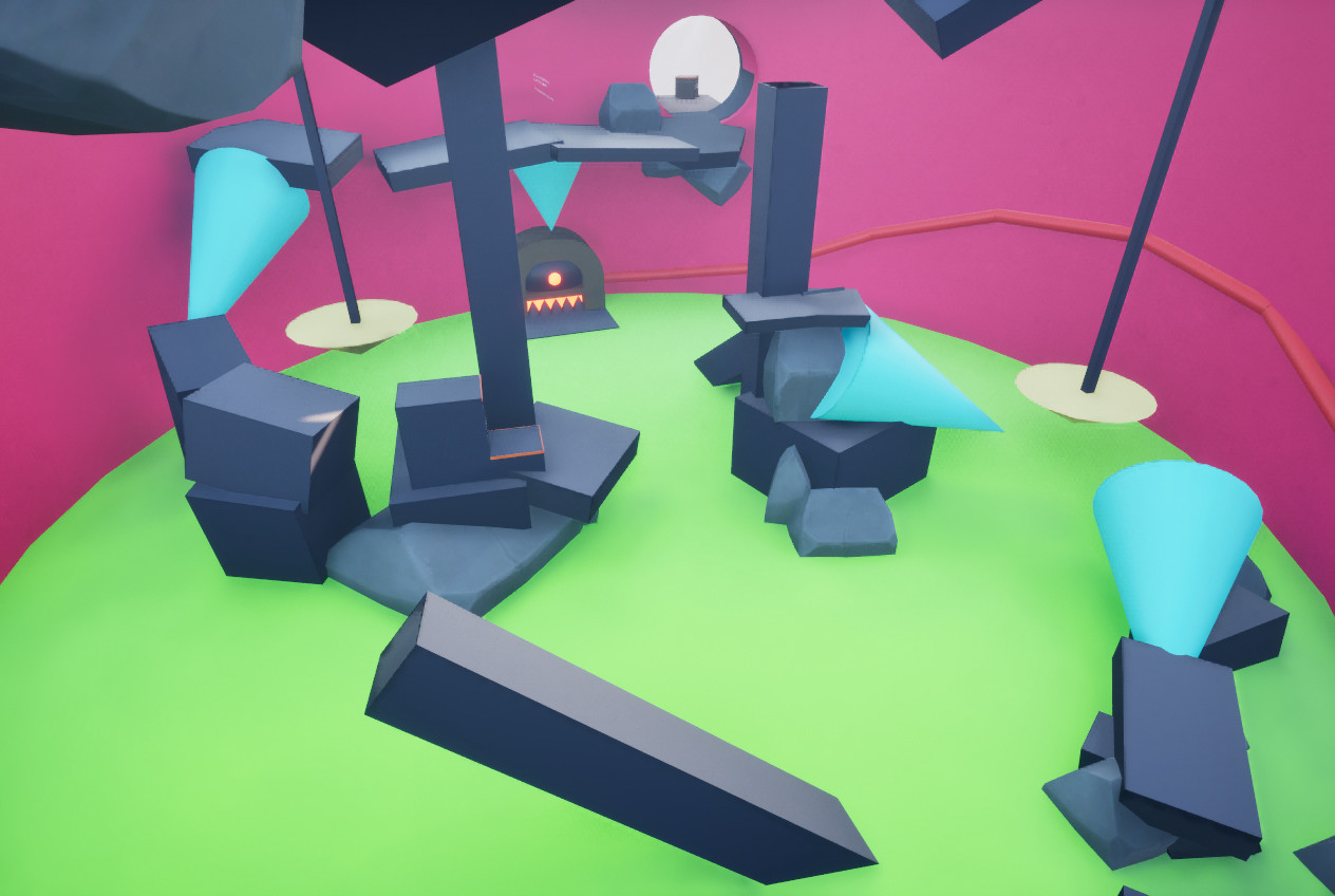
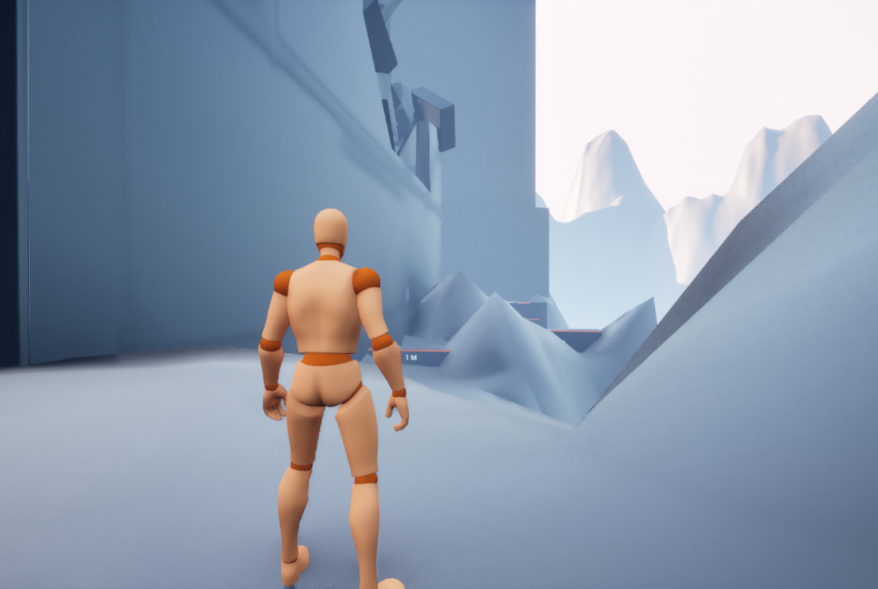
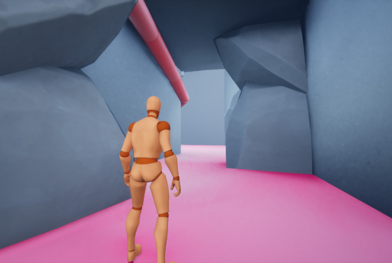
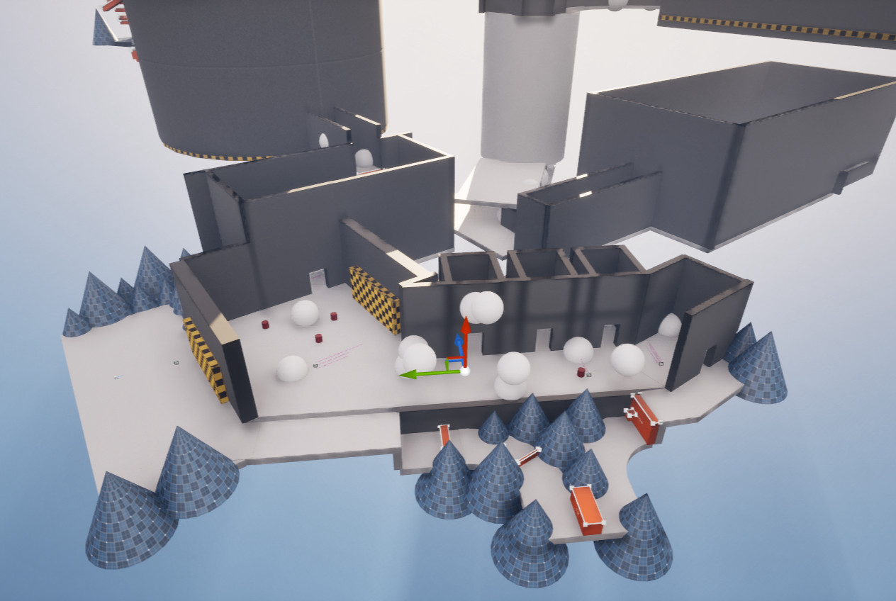
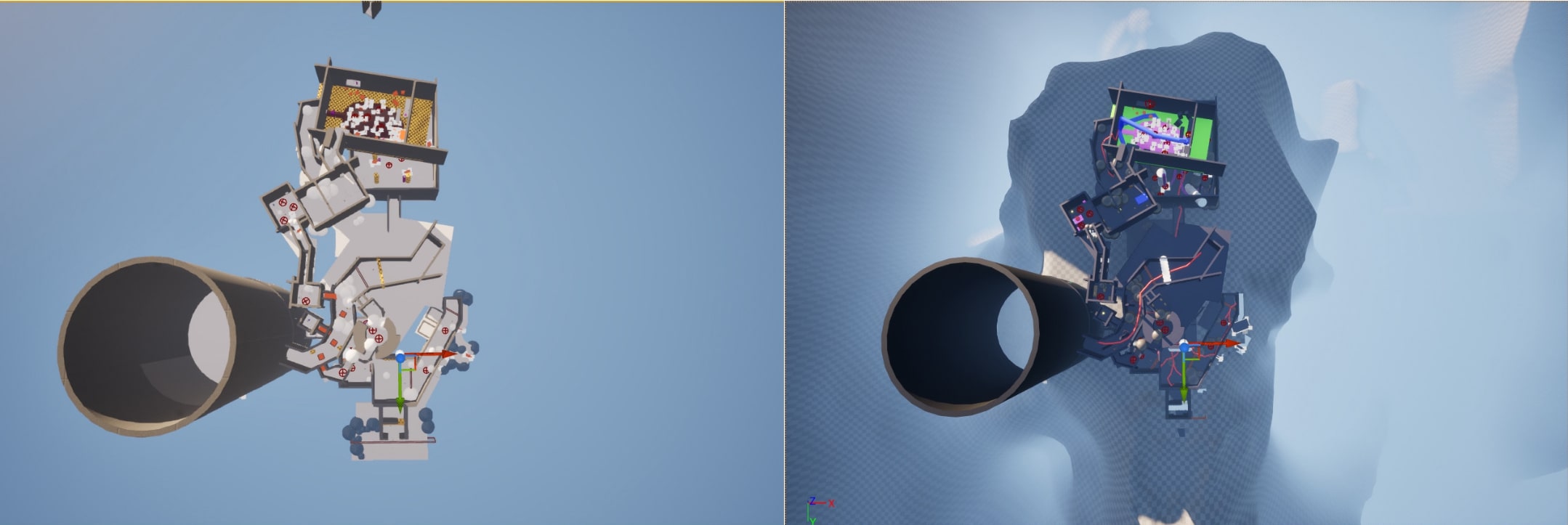
Sculpted terrain to better convey the environment after players found previous outer-area objects confusing.